| Image |
Comment |
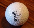
| 07/06/2005 12:53:35 PM |
Orange Attackby AlexSaberiComment: great idea. slightly more care in placementof subject would be better for me. slight loss of detail as well at this resolution - maybe a sharpness issue. I might have tried a square crop to maximise the size available on this site and retain small detail. |
 Photographer found comment helpful. Photographer found comment helpful. |
| 07/06/2005 12:52:12 PM |
Center of Societyby sryworkComment: not sure what this is, but it is too light - all that contrast wasted without deep blacks to lose yourself in! |
| 07/06/2005 12:51:39 PM |
Retiredby ecdillonComment: nice subject matter. wood colours feel a little dull. lighting very flat - might be better in early mornign or late evening. lacking in real interest. |
| Photographer found comment helpful. |
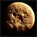
| 07/06/2005 12:50:23 PM |
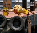
Circles on a Sphereby netdudeComment: yellow colour cast unattractive. subject very central - getting in a bit closer/cropping harder, might have added depth and interest. |
| Photographer found comment helpful. |
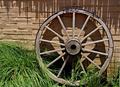
| 07/06/2005 12:49:40 PM |
loose ring snafflesby dragonladyComment: only just see the circles. Not as obvious as it might be. would like to see richer colours in wood (eg winner of leading lines treatment). |
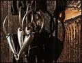
| 07/06/2005 12:48:48 PM |
Power by MICKEYby ltaylorComment: good circles, image a bit small, sky might have benefited from more dramatic post processing (contrast up, saturation up) |
| Photographer found comment helpful. |
| 07/06/2005 12:47:58 PM |
|
| Photographer found comment helpful. |
| 07/06/2005 12:47:28 PM |
|
| Photographer found comment helpful. |
| 07/06/2005 12:46:51 PM |
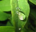
Wet Circleby DarriComment: oft-done shot, and often done better than this, I am afraid: DoF too narrow (try higher Av setting) |
| Photographer found comment helpful. |
| 07/06/2005 12:46:05 PM |
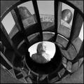
The Time Machineby jmritzComment: clever image. great tonal quaity. not sure whether an adult makes the best subject here - the position of model is very central to the opening (child head peeping over might have been more interesting). |
| Photographer found comment helpful. |
Home -
Challenges -
Community -
League -
Photos -
Cameras -
Lenses -
Learn -
Help -
Terms of Use -
Privacy -
Top ^
DPChallenge, and website content and design, Copyright © 2001-2026 Challenging Technologies, LLC.
All digital photo copyrights belong to the photographers and may not be used without permission.
Current Server Time: 07/17/2026 12:56:06 AM EDT.