| Image |
Comment |
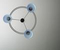
| 07/06/2005 01:06:03 PM |
Circle of Dreamsby RayEthierComment: funny colour cast, and it is too close to wall - the shadows do not add. Lighting v flat, and angle uninteresting. contrast too high, meaning all detail is lost. |
 Photographer found comment helpful. Photographer found comment helpful. |
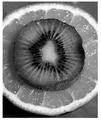
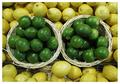
| 07/06/2005 01:04:40 PM |
Gray Fruitby chik0325Comment: frame uneven is very distracting. fruit interesting, but central compostion is static, and surely the point is colour! And kiwi and orange are not necessarily the best combination, in that the scene feels false. |
| Photographer found comment helpful. |
| 07/06/2005 01:03:30 PM |
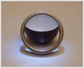
Simple Shape, Simple Messageby TallblokeComment: good idea. slightly bigger DoF would work better. more copntrast might have shown up the reflection better and generally had more impact. |
| Photographer found comment helpful. |
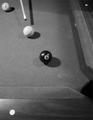
| 07/06/2005 01:02:30 PM |
For the Winby nick800Comment: good idea, but quite soft image. angle is unexciting (check out the pool shot that is ranked as no. 1 highest score on this site - works because it is a good angle). compositionally, the three balls do not sit compforatbly within the frame - and the area around the two sides makes an unsatisfying partial frame, where space is wasted. adding a hand might have added a human/interest touch as well. |
| Photographer found comment helpful. |
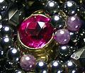
| 07/06/2005 12:59:22 PM |
Ruby Circleby nalliComment: too small - check out the tutorial on submitting images to the site. |
| Photographer found comment helpful. |
| 07/06/2005 12:58:41 PM |
|
| Photographer found comment helpful. |
| 07/06/2005 12:58:01 PM |
Ring of Lightby dw_photoComment: nice composition. unfortunate that you have a chipboard ceiling - as for me, that is a distraction. lighting perhaps a bit flat (though hard to do muchwith that here, I expect). |
| Photographer found comment helpful. |
| 07/06/2005 12:56:47 PM |
Got a Light?by Ice-Tea-1983Comment: gorgeous abstract. Would have tried it with some other compositions (eg third lines) to test, but I like this. |
| Photographer found comment helpful. |
| 07/06/2005 12:55:51 PM |
Citrusby sylandrixComment: colours are washed out here - needs to bve balanced with a colour cast. Prob less blue green and more red tones. |
| Photographer found comment helpful. |
| 07/06/2005 12:54:41 PM |
The Ring and the Teacupby 3amfromkyotoComment: Very pretty - striking image. Love the abstract. Not sure about composition. Slight yellow cast in background does not work with the blue for me. |
| Photographer found comment helpful. |
Home -
Challenges -
Community -
League -
Photos -
Cameras -
Lenses -
Learn -
Help -
Terms of Use -
Privacy -
Top ^
DPChallenge, and website content and design, Copyright © 2001-2026 Challenging Technologies, LLC.
All digital photo copyrights belong to the photographers and may not be used without permission.
Current Server Time: 07/17/2026 02:08:01 AM EDT.