| Author | Thread |
Comments Made During the Challenge  |
|
|
07/12/2005 09:27:48 AM |
|
I like the execution, but not fond of the lighting. |
|
 Photographer found comment helpful. Photographer found comment helpful. |
|
|
07/10/2005 10:31:09 PM |
|
| Photographer found comment helpful. |
|
|
07/10/2005 12:42:08 PM |
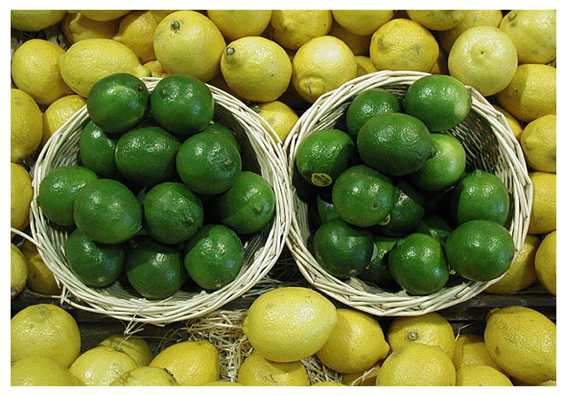
I used to work in grocery, so I appreciate this pic. I am guessing that you couldn't have had access enough to fill in the gaps at the bottom. I think it might have been nice to see a fruit cut in half. maybe half a lemon mated to half a lime for some nice relationship. I might have also flipped a few of the stickers down.
Otherwise, it's a little blown in some parts, particularly on the lemons and a bit wan in it's saturation. |
|
| Photographer found comment helpful. |
|
|
07/09/2005 11:17:01 PM |
|
I was just in Rio de Janeiro on the beach and got some lime on my hand, and the acid, combined with the hot sun, burns your skin and leaves a red mark that's going to be there for about 5 months. Just a fun fact for you. |
|
| Photographer found comment helpful. |
|
|
07/09/2005 09:35:12 AM |
|
| Photographer found comment helpful. |
|
|
07/08/2005 05:56:46 PM |
|
the yellow is sort of dead looking. composition lacks interest. nice green and good idea. |
|
| Photographer found comment helpful. |
|
|
07/08/2005 12:55:02 PM |
|
A different approach. Less would be more. |
|
| Photographer found comment helpful. |
|
|
07/08/2005 12:26:17 AM |
|
nice composition. wonder if you could bring out the yellow a bit? this picture just BEGS to be oversaturated! |
|
| Photographer found comment helpful. |
|
|
07/07/2005 01:04:53 AM |
|
Nice take on the challenge. I like the contrast in colors, however, they appear to be a little dark, flat and dull. Perhaps a little boost in saturation would give the lemons and limes that pop in color and depth. Good luck in the challenge :-) |
|
| Photographer found comment helpful. |
|
|
07/06/2005 04:27:38 PM |
|
This photo needs some saturation to make the colors pop. They look very unappealing how they are. |
|
| Photographer found comment helpful. |
|
|
07/06/2005 03:28:04 PM |
Fit to challenge criteria: 2/2
Contrast/Colors: 1/2
Photo Quality: 1/2
Composition: 1/2
My subjective affinity: 0/2 |
|
| Photographer found comment helpful. |
|
|
07/06/2005 12:55:51 PM |
|
colours are washed out here - needs to bve balanced with a colour cast. Prob less blue green and more red tones. |
|
| Photographer found comment helpful. |
|
|
07/06/2005 11:58:08 AM |
|
I've tried these shots and know how hard it is to control the lighting. But you've done it very nicely. |
|
| Photographer found comment helpful. |
|
|
07/06/2005 06:43:34 AM |
|
I think more saturation would have worked well in this pic. Anyway a nice one! |
|
| Photographer found comment helpful. |
Home -
Challenges -
Community -
League -
Photos -
Cameras -
Lenses -
Learn -
Help -
Terms of Use -
Privacy -
Top ^
DPChallenge, and website content and design, Copyright © 2001-2026 Challenging Technologies, LLC.
All digital photo copyrights belong to the photographers and may not be used without permission.
Current Server Time: 06/30/2026 05:16:17 PM EDT.