| Image |
Comment |
| 10/31/2007 07:51:41 AM |
So Near Yet So Farby MAKComment: seems it was a low scoring challenge. Genius on both our parts not fully recognised by the so-called "voters". |
 Photographer found comment helpful. Photographer found comment helpful. |
| 10/01/2007 03:15:12 PM |
|
| Photographer found comment helpful. |
| 09/30/2007 11:52:51 AM |
iMode 2.0by RulerZigzagComment: Hello from the critique club
You have a good start in a better looking model than MAK (Hanae's other half)! Only joking if you read this MAK...
This image scored pretty well and you have some good comments already. I think that you did a good job of getting the set up right, and it is definitely recogniseable.
Areas where is falls short of Hanae's attempt are in the lighting a little - you have a yellow tinge (which you could have sorted in post-processing), and the lighting is not as strong. To make light more harsh, you need to use a smaller light source and/or move it further away - but at the expense of brightness (requiring longer shutter times).
Your subject looks a little more crumpled than Hanae's MAK - this distracts a little as the folds lead the eye away from the phone.
You have sharpened your image less than Hanae did - I think that Hanae's image is a little oversharpened, but somewhere in between your images might be my preference.
Good luck with your next challenge.
Cheers
Matthew
|
| Photographer found comment helpful. |
| 09/30/2007 11:43:22 AM |
Emotional Outlet reduxby snafflesComment: Hello from the Critique Club
You have chosen an image to reproduce that is probably hard to do than it looks (testament to scalvert's original). However, your camera has good macro functionality, so this is not a bad choice of image. You came low in sequence, but should take heart from the 5+ score that you got.
In terms of constructive criticism, you have received some comments already.
Scalvert's original did a couple of things that your image does not. It retained a degree of three dimensionalism by taking a stronger angle and by using a socket that more obviously protruded from the wall. This also introduced a shallow depth of field that focusses attention on the water drop.
Scalvert used a hard light from the top left to increase local contrast and to define the areas around the plugholes - yours do nothave this shadow, which are needed to create a real sense of depth to the image.
Scalvert has used good white balance settings for the lighting he had available - yours is a little off white, which is easily correctable either in camera or on the computer - you have some advice from others already but the forums will help further on this.
Good luck with your next entry!
Cheers
Matthew |
| Photographer found comment helpful. |
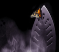
| 09/30/2007 11:32:17 AM |
Metatate's "Iron Butterfly"by HaneckComment: Hello from the Critique Club
First off - this is a great image to be proud of (even if not original)! First impressions are good - technicals are sound and you have caught the likeness well.
I only have minor constructive criticisms to make.
In terms of a copy, it does well. You have not quite got the luminescence of the butterfly from the original.
Minor nitpicks are that there are some odd circles in your steam on the left (too big for dust spots?) and there is some softness in the lower part of the iron. Your iron is a little less engaging in its hole pattern, and the steam has an odd look - the blurring is not quite right - either to fast or too slow a shutter speed perhaps.
Overall, a really good image that placed well as a result.
Cheers
Matthew
|
| Photographer found comment helpful. |
| 09/24/2007 03:50:39 PM |
Le Bleu Nuitby pawdrixComment: This is a superb image - cannot believe I haven't seen it before. Good job Steve! |
| Photographer found comment helpful. |
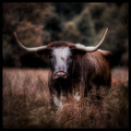
| 09/09/2007 03:02:52 PM |
Taurusby SimmsComment: Yeah right - this is the same cow. Expert editing means that you can twist the horns round and we would never know.
Good job though - I like the hue. |
| Photographer found comment helpful. |
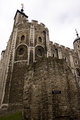
| 09/09/2007 02:49:59 PM |
IMG_3829.jpgby dpdaveComment: Dave,
your title "The White Tower, roman wall in foreground" is a little contradicted by the image, which clearly shows a wall marked as "12th Century"... ;-) Message edited by author 2007-09-09 14:50:19. |
| Photographer found comment helpful. |
| 08/25/2007 01:19:33 PM |
Bussiness Card scan copy.jpgby cwyouComment: Please take the following as it is intended, as constructive criticism. I'm afraid that my first impressions are:
too much detail in the lashes and the skin - we are more used to softer tones and shallower DOF for theseds of shots. This does not end up looking glamorous as a consequence.
The globe in eye thing I thought was a printing mistake. It needs to be more obvious, or got rid of: the eye is enough by itself.
I'm not a huge fan of the colour scheme or the font - but that is a very personal thing. |
| Photographer found comment helpful. |
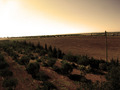
| 08/23/2007 01:44:15 PM |
sepia expanseby itakephotosComment: It is tough taking a shot into the light - the contrast of the bright sky and dark gound is hard to balance. But it looks like you took the picture at a good time of day, and I like the sepia effect. |
Home -
Challenges -
Community -
League -
Photos -
Cameras -
Lenses -
Learn -
Help -
Terms of Use -
Privacy -
Top ^
DPChallenge, and website content and design, Copyright © 2001-2026 Challenging Technologies, LLC.
All digital photo copyrights belong to the photographers and may not be used without permission.
Current Server Time: 06/26/2026 01:00:20 PM EDT.