| Image |
Comment |
| 03/21/2005 11:38:02 AM |
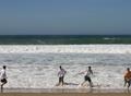
Friends before the wavesby MotzerelaComment: far too small!! plus the guys on the edge of the frame look a bit too close to the edges (ie partly cropped) and a few pixels more would have helped the composition. |
| 03/21/2005 11:37:00 AM |
Perched Palby Art RoflmaoComment: Soft focus a real turn off for me - and a bit cloying. T-shirt logo is distracting. |
 Photographer found comment helpful. Photographer found comment helpful. |
| 03/21/2005 11:36:11 AM |
Snuggle Friendsby naomikComment: Too cloying for my taste, and made much worse by the use of the soft border. Dog looks a bit startled. |
| Photographer found comment helpful. |
| 03/21/2005 11:34:49 AM |
|
| Photographer found comment helpful. |
| 03/21/2005 11:30:37 AM |
|
| Photographer found comment helpful. |
| 03/21/2005 11:19:47 AM |
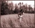
power and friendshipby imagesloyolaComment: Not really a "best friends" photo, in my book. So much action leaves a lot of blur - a faster shutter speed might have helped freeze more of the action. |
| 03/21/2005 11:17:59 AM |
Inseparableby CrystalFuryComment: I am not a fan of soft focus sepia and this is a little too "cloying" for me. |
| 03/21/2005 11:14:15 AM |
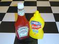
Picnic Buddiesby birdietwoshoesComment: Nice idea (though probably less obvious for us non-US citizens). I don't like the colour cast in the shadow, and wonder if using greater depth of field might not have focussed attention on the subject matter. Colours appear a little blown on the mustard bottle. |
| 03/21/2005 11:11:56 AM |
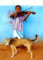
He Leads, I Followby beamsclanComment: Love the colour and composition. Not too much "best friends" necessarily coming out if it, but a great photo. |
| Photographer found comment helpful. |
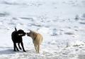
| 03/21/2005 11:10:42 AM |
stickin' togetherby saintaugustComment: My dogs do this. Difficult to expose correctly for snow and white and black fur. There is a lack of detail in the black dog, but I'm not sure how you would get much better detail without overexposing the snow detail. I know that animals are hard to direct, but I find the disturbed snow/ice on the bottom right a little disturbing. But a great picture! |
| Photographer found comment helpful. |
Home -
Challenges -
Community -
League -
Photos -
Cameras -
Lenses -
Learn -
Help -
Terms of Use -
Privacy -
Top ^
DPChallenge, and website content and design, Copyright © 2001-2026 Challenging Technologies, LLC.
All digital photo copyrights belong to the photographers and may not be used without permission.
Current Server Time: 06/25/2026 08:53:52 PM EDT.