|
|
|
Showing 9161 - 9170 of ~9564 |
| Image |
Comment |
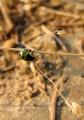
| 06/30/2005 05:02:41 PM | The Analog Artist. (Look Closer)by GeocideComment: I've looked closer and didn't find much more than when I first saw it. Sorry. I'm sure that there is "something" there that I am missing, but I just don't see it (and I've come back to this image more than 5 times). I love the colors and beautiful lines of the smoke (I assume it's smoke), but I still fail to grasp the relevance to the Obsolete Challenge. I scored it as high as I did, because I think it's a cool image - just not relevant (to me) to the current challenge. 3 |  Photographer found comment helpful. Photographer found comment helpful. |
| 06/30/2005 04:59:24 PM | Sightby bcobleComment: While I understand that the challenge is to "Take a picture of something that has outlived its usefulness. It could be old technology, broken, discarded, outgrown, forgotten - anything. Exception: people (alive or dead) are not to be the main subject.", I am not really captured by this shot. The left eye (right eye of the cat), while obviously manipulated to augment or simulate blindness, still doesn't (IMHO) convey a strong sense of obselescence.
The photo overall is also overexposed and too close to the subject to be a powerful close-up and too far from the subject to be a good macro. I think I understand what you were trying to convey - blindness of a cat and the physical and visible implications of the lack of sight, but I just don't think you achieved it in this particular image.
I do think that the idea is really cool and a unique take on an overly saturated topic of wheels, trains, typewriters, floppy disks, LPs, cassettes, 8 tracks, cars, and abandoned buildings, but the idea isn't enough if the actual content doesn't convey what you're trying to present. I'm really disappointed that I couldn't vote this higher due to the quality of the photo - as opposed to not meeting the challenge. You've spent a lot of thought on the topic - that much is clear, but unfortunately, it didn't translate to a uniquely superior image. 2 | | Photographer found comment helpful. |
| 06/30/2005 04:51:28 PM | The fury of the old black...by fquintansComment: Sorry, but the blurred image (although obviously taken of a rotary telephone) does not (IMHO) clearly represent anything meaningful (even with the title). Yes, the challenge required "Take a picture of something that has outlived its usefulness. It could be old technology, broken, discarded, outgrown, forgotten - anything. Exception: people (alive or dead) are not to be the main subject.", but it's difficult to distinguish any major subject or meaning from this photo (IMHO). I understand that it is of a rotary telephone, but why not represent it more clearly? 1
|
| 06/30/2005 04:48:15 PM | insectby philoup2Comment: Sorry, but this shot seems OOF and off topic for the challenge (IMHO). Perhaps you were drawing some reference from the topic, but I don't see anything (especially with the title emphasizing the insect) that is broken, out of use, outdated, or obsolete. 1 |
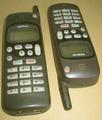
| 06/30/2005 04:45:20 PM | Nobody uses mobile telephone so heavyby AntoninoComment: These phones look exactly the same to me, and I can't tell where you're drawing the line of obselescence. I like the juxtaposition, but would have liked to see you juxtapose opposites. To me (as is) doesn't really meet the challenge - sorry. 2 |
| 06/30/2005 04:42:57 PM | Antiquated Accuracyby kdeleonComment: Nice take on a certainly antiquated (altho still used) method. I used to use a metronome every day when practicing the piano throughout my childhood. I like the colors and the overall composition, but the angle of the metronome is a little "off" to me and the blurred image of the pendulum is a bit of a distraction - might have been better to have one strong position highlighted. Still, overall a very unique and strong entry in this challenge. 6 | | Photographer found comment helpful. |
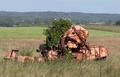
| 06/30/2005 04:37:14 PM | The old harvesterby mark8700Comment: Nice work of detail in foreground and blur in background, although I think the shot is overexposed overall and the sky is not very interesting (not that it's your fault for the weather!). :-) Oddly enough, I think you have great detail, but it's just not close enough to the front and the background could have much less. I think too, that you could have offset the main subject a little - rather than being dead center. Regardless, it's a nice image and a strong entry. 6 |
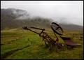
| 06/30/2005 04:34:24 PM | Upside Down by arnitComment: Great composition and leading lines from the equipment to the mountain (altho I know that's a different challenge). Nice colors too - I'd like to have seen a little sharper focus, but all in all a great image. 7 | | Photographer found comment helpful. |
| 06/30/2005 04:32:55 PM | | | Photographer found comment helpful. |
| 06/30/2005 04:31:19 PM | | | Photographer found comment helpful. |
|
Showing 9161 - 9170 of ~9564 |
Home -
Challenges -
Community -
League -
Photos -
Cameras -
Lenses -
Learn -
Help -
Terms of Use -
Privacy -
Top ^
DPChallenge, and website content and design, Copyright © 2001-2026 Challenging Technologies, LLC.
All digital photo copyrights belong to the photographers and may not be used without permission.
Current Server Time: 07/22/2026 03:49:49 AM EDT.
|