| Image |
Comment |
| 07/10/2005 12:07:42 AM |
Off To Save A Life!by JayWalkComment: Cool shot and idea. Nice movement capture. The background is a little drab (doesn't really add to the image IMHO). I know this is a really picky detail too, but I wanna see the LIFE SAVERS lettering on the mint right-side up. Overall good entry. 6 |
 Photographer found comment helpful. Photographer found comment helpful. |
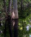
| 07/10/2005 12:05:37 AM |
Rings & Reflectionsby notonlineComment: Base score 5. -2 for lack of obvious circle(s), composition +1, beauty/personal appeal +1. Lighting good/okay (some blown highlights) +0. =5 |
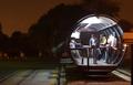
| 07/10/2005 12:01:42 AM |
Waiting for a night busby mmusicanteComment: Very cool shot. Love the lighting and DOF inside the tube, but the background is a little drab. Not sure how it could be spiced up or de-emphasized more (and I'm probably not expressing myself very well - sorry), but overall it's still a very good capture. 7 |
| Photographer found comment helpful. |
| 07/09/2005 11:59:46 PM |
Crop Circle of Buttonsby kaelvaComment: Unique and interesting shot. Meets the challenge well on a couple of levels. IMHO, I think voters will probably deduct because of the image's small size. Because it is so small, you lose some of the detail that would otherwise be apparent (and I 'think' you have good DOF, but it's hard to tell). 7 |
| Photographer found comment helpful. |
| 07/09/2005 11:57:39 PM |
California Shadeby SamfordSpleenlessComment: Very unique shot that meets the challenge well. I think I'd like it better if it wasn't dead center of the crop. Still... Nice lighting and DOF. 6 |
| 07/09/2005 11:56:10 PM |
American Independence Dayby justin_hewlettComment: Nice fireworks shot. It's a little busy, but is better than most of the others I've seen entered. IMHO, I think it's cropped a bit too closely - takes away from the awe factor for me. 5 |
| Photographer found comment helpful. |
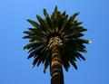
| 07/09/2005 11:53:44 PM |
Tuscan Sunby pelfComment: Simply beautiful. The only thing that bothers me about this shot (and it's a VERY minor thing) is the lack of DOF on some of the leaves/branches. It perfectly meets the challenge and I'm surprised there weren't any other entries like it. Very well done. 9 |
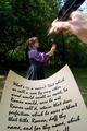
| 07/09/2005 12:07:23 PM |
Following Shakespeare's Leadby magnusComment: *Critique Club Comment*
First of all, I think it met the Leading Lines II Challenge quite well (both figuratively by the words and literally by the line of the pen).
Composition
I think it is well composed, but might add some interest by off-centering your subjects a little more. The different sizes of your subjects in the foreground, midground, & background work well to establish both perspective and depth.
Lighting
Love the sparkle of light on the pen. Very good lighting on the paper and great lighting on the rose. The model could use a little more light/contrast and evening out of tones/highlights. I think the background is a little dark.
DOF
Excellent. The only minor thing I notice is that the model could be a little less "soft". Also, perhaps less emphasis on the background (gaussian blur perhaps?).
Color
Also very good. My only suggestion is again regarding the background. Perhaps bumping the sat up would make it brighter and more interesting (IMHO).
Overall
A really strong entry that I think finished much lower than I expected. You met the challenge perfectly and executed a technically superior image. Great job!
Just my 2 cents...
Jimmy
|
| Photographer found comment helpful. |
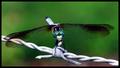
| 07/09/2005 10:40:05 AM |
Pitch Roll and Yaw with a Serious Attitudeby rblantonComment: Nice capture, but there's some stiff competition in this challenge. Your DOF, while pretty good, doesn't really stand out when compared to some of the other entries. More particularly on the wire, end of tail, head and legs of fly. I like the blurred background and overall composition, but the lighting is a little harsh causing some hot spots on the wire and fly. Still, a very nice shot. 6 |
| Photographer found comment helpful. |
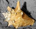
| 07/09/2005 10:37:07 AM |
Beachedby pedahel7Comment: Good DOF and I like the composition. The lighting is harsh making the highlights a bit blown out, causing a loss of color and definition. Also, while this is a beautiful shot, I'm not sure I'd consider it a macro because I know that these particular shells get to be very large. Still a nice capture and I have to give the benefit of the doubt on the macro thing. 6 |
| Photographer found comment helpful. |
Home -
Challenges -
Community -
League -
Photos -
Cameras -
Lenses -
Learn -
Help -
Terms of Use -
Privacy -
Top ^
DPChallenge, and website content and design, Copyright © 2001-2026 Challenging Technologies, LLC.
All digital photo copyrights belong to the photographers and may not be used without permission.
Current Server Time: 07/22/2026 05:54:31 PM EDT.