| Image |
Comment |
| 07/20/2005 09:14:15 PM |
|
 Photographer found comment helpful. Photographer found comment helpful. |
| 07/20/2005 09:11:10 PM |
Got Mlik?by DustDevilComment: Neat shot - I wondered if anyone was going to emulate a similar entry from the last Textures challenge. :-) Pretty good DOF, but I'm not crazy about the crop (top, bottom, & left side - I like the split face). Lighting is a little harsh, but I like the use of B/W. Cute title too. |
| Photographer found comment helpful. |
| 07/20/2005 09:09:10 PM |
message in a bottleby ursulasComment: Neat idea, but to me, this image seems pretty flat. Not much DOF came through (not sure why). Not crazy about the orange glow either, although I understand that it does add some warmth to the shot. The image just doesn't seem to "pop" like I think it could. |
| Photographer found comment helpful. |
| 07/20/2005 09:07:15 PM |
Pebblesby CLarson557Comment: Nice clear shot that certainly meets the challenge. I wish there was a little more variation in color, but the border adds to this image nicely (it's B/W on the outside, right?). Really good DOF too. This one takes some examination (and I'm afraid it will probably be overlooked by many viewers/voters) to really appreciate it. Nice work. Bumping up. |
| Photographer found comment helpful. |
| 07/20/2005 09:04:22 PM |
prickly protectionby beafliesComment: Magnificent colors! Good lighting and pretty good DOF. I don't think I gave this shot enough credit on my first pass - it's quite good. (Bumping up) You've got a lot of good textures going on in this image, and I like the border. |
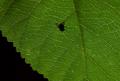
| 07/20/2005 09:02:24 PM |
Fly Silhouette as Viewed from The Bottomsideby HornOUBetComment: While a cool shot, I think it would be more suited to a shadows or light entry. There are a lot of veined leaves in this challenge, yet not many of them really show their texture (if you know what I mean). Most of them look kinda flat. Don't get me wrong, I can see some ribs on this one and as I said, I think it's a good shot. And the fly, while it adds interest, doesn't really add any texture to this particular shot. Not trying to be completely negative - I hope these comments are beneficial (at least as another person's opinion). 6 |
| Photographer found comment helpful. |
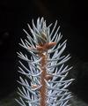
| 07/20/2005 08:36:06 PM |
Colorado Blue Spruce - Not Softby fixedintimeComment: You've got goo definition in the sprig, but I don't care for the placement/crop, placing it in the dead-center of the image. I like the muted tones. I don't understand the title, but no points off for that (I don't understand a lot of things!). |
| Photographer found comment helpful. |
| 07/20/2005 08:34:24 PM |
Harmonyby tsheetsComment: Interesting choice for textures. Speakers (I think that's what this is) do have some unusual and distinctive characteristics, but I'm not sure that the crop you chose put those in the best light. Although slanted, the subject is pretty dead-on center, making it less visually appealing (IMHO). I like the blue tones. |
| Photographer found comment helpful. |
| 07/20/2005 08:31:39 PM |
How Sad Is This!!by dphillipsComment: Nice capture. I can almost feel and smell him/her! I do think the crop is a little too tight - I'd like to see the end of his/her snout. It doesn't look like it was an artistic choice of crop at the bottom (I could be wrong), but the other crop sides are great. Nice colors too. |
| Photographer found comment helpful. |
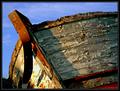
| 07/20/2005 08:29:22 PM |
Old and brokenby JohannesFrankComment: I think I've seen this old wreck in another challenge (not this particular shot, but the same boat). I could be wrong... ;-)
Anyway, I think this is a great shot. Beautifully detailed, composed, and toned. Really shows a lot of texture. The sky is a little blah, but still a very strong entry - good job. |
Home -
Challenges -
Community -
League -
Photos -
Cameras -
Lenses -
Learn -
Help -
Terms of Use -
Privacy -
Top ^
DPChallenge, and website content and design, Copyright © 2001-2026 Challenging Technologies, LLC.
All digital photo copyrights belong to the photographers and may not be used without permission.
Current Server Time: 07/24/2026 10:46:12 AM EDT.