| Image |
Comment |
| 07/24/2005 10:53:52 PM |
Colorful Canvasby mikalaComment: Very cool shot. I think the lighting was a little harsh though, causing some glare in the highlights/reflections. Nice color and composition though. |
 Photographer found comment helpful. Photographer found comment helpful. |
| 07/24/2005 10:41:20 PM |
Red Feelingby toadtheprinceComment: IMHO
What works: colors, composition, border. What doesn't work: no real "feel" of texture shown other than the dirty wrinkles in the fabric or paper (can't even tell what the flag is made of). |
| Photographer found comment helpful. |
| 07/24/2005 10:39:01 PM |
Tomatoby UrviComment: IMHO
What doesn't work: color is drab, lighting is harsh, background should be uniform, crop could be more interesting (get it out of the dead center). What works: tomato's familiar textures, juiciness of the tomato, dark general background. |
| Photographer found comment helpful. |
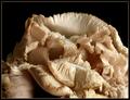
| 07/24/2005 10:36:39 PM |
Oyster Mushrooms — Cluster 1by Bear_MusicComment: Interesting shot. I think the lighting is a little harsh, causing you to lose some detail (especially given the mushroom's naturally light color). You've got good DOF and I like the composition (& border). |
| Photographer found comment helpful. |
| 07/24/2005 10:34:41 PM |
Untouchableby BalkanComment: Good cactus shot, but I think the fact that it's so centered in the frame that it doesn't lend itself to being as interesting as it could be. You might want to try a different crop to add something to the shot. Still a good photo - pretty good sharpness and color. |
| Photographer found comment helpful. |
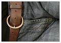
| 07/24/2005 10:32:50 PM |
Rawhide n’ denim…by TerramarComment: Very cool idea. I like the composition (and everyone knows what leather belts and jeans feel like) - it meets the challenge well. I like the composition and crop. It may sound strange, but I think that if the jeans were more "worn" and/or included a rattier feel, this image would score higher with voters. |
| 07/24/2005 10:30:56 PM |
...Antlike...by ApeeComment: I think this could be a really great photo. Unfortunately, I think it currently could use a little work on lighting, color and DOF. The lighting is a bit harsh, causing a glare. The angle of the shot is interesting, but because of the crop it is difficult for the viewer to get his/her bearings right away - you might try moving the tree trunk out of the center of the shot. The textures of the bark are great. |
| Photographer found comment helpful. |
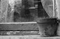
| 07/24/2005 10:27:25 PM |
Face in the Windowby willg133Comment: I think the title draws too much attention away from the numerous good textures in this shot. It's a good shot - could be a little sharper - but nice composition. |
| Photographer found comment helpful. |
| 07/24/2005 10:25:30 PM |
Strange Puzzleby bcobleComment: I like the interesting perspective and angle on this shot. Nice colors, although there is a bit of a glare. Unusual and creative entry. |
| Photographer found comment helpful. |
| 07/24/2005 10:20:49 PM |
Patriarch with Sonsby rjksteschComment: *Greetings from Critique Club*
First of all let me say that I'm sure you got a lower score on this shot because many viewers did not see the relationship to the "Family" Challenge (see comments). It's a really nice shot though (also as evidenced by a number of comments).
Composition
I really like it. I like the close crop and the slightly off-center placement of the smokestack. You've got nice vertical and horizontal references.
Lighting/Color
Both are great. You've got some nice shadows on the boats and the colors are naturally vivid without being overpowering or oversaturated. One thing that is a little distracting to me is the large shadow in the mountains. I'm sure it's probably a shadow of an adjoining peak or a cloud, but because of the crop and the shape of the shadow, it's not evident.
DOF/Definition
Also both very good. I think the clarity is especially sharp.
OVERALL
Relationship to challenge topic was sketchy and really hurt your score. Otherwise, there's really very little I find that I would change about the shot (although the suggestions made to shoot it from a lower angle and/or to make it a triptych might prove interesting).
Very nice work. Just my 2 cents...
Jimmy
|
| Photographer found comment helpful. |
Home -
Challenges -
Community -
League -
Photos -
Cameras -
Lenses -
Learn -
Help -
Terms of Use -
Privacy -
Top ^
DPChallenge, and website content and design, Copyright © 2001-2026 Challenging Technologies, LLC.
All digital photo copyrights belong to the photographers and may not be used without permission.
Current Server Time: 07/24/2026 07:50:30 AM EDT.