| Image |
Comment |
| 07/27/2005 08:14:14 PM |
Whisperby Joey LawrenceComment: My favorite shot of the series. Really awesome job. Very dark and it really seems to be filled with feeling (at least to me). Almost like that familiar inward aura of an oncoming depression. |
 Photographer found comment helpful. Photographer found comment helpful. |
| 07/27/2005 08:10:22 PM |
|
| Photographer found comment helpful. |
| 07/27/2005 07:56:52 PM |
CRW_6233-sepiaby NusbaumComment: Fantastic shot! Lighting, expression, tones, composition are all terrific. I really love it as is. |
| Photographer found comment helpful. |
| 07/27/2005 07:55:20 PM |
CRW_6258-sepiaby NusbaumComment: Great shot - she has a very unusual expression on her face (almost a 'come hither' glance). |
| Photographer found comment helpful. |
| 07/27/2005 06:59:57 PM |
In Time's Pastby ladyhawk22Comment: This is a beautiful shot (and the sentimental value you have for it comes through in your representation of the piece).
I remember this well from the Macro V Challenge and thought it would have finished much higher, but I imagine that it scored lower because it didn't fit most people's stereotypical definition of a "macro".
I think you did a great job with the lighting and making it feel "antique" with your tonal choice. The gold inlays really display well. There are only two things that bother me about it: 1) the white area in the upper right and 2) the blurriness of the seconds circle at the bottom center.
Still, a great shot and I'm glad you shared it. Just my 2 cents... |
| Photographer found comment helpful. |
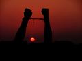
| 07/27/2005 06:48:55 PM |
Breaking the Bindsby Prime_TimeComment: *Greetings from the Critique Club*
First let me say that I think this is a very powerful image that met the Independence Challenge quite well (as exemplified by your score - congratulations on your top 10 finish!).
That of course, also makes it difficult to provide additional feedback on! LOL However, I'll give it a shot (and remember it's just one opinion that you can take or leave as you wish).
Met the Challenge
Quite well in an emotional and very visually attractive way.
Composition
Very nice work. I like the off-center placement of the main subject, the sunset/rise between the upheld arms/fists, the silhouette effect of the background. Two things (IMHO) that I think could have been improved on here are being able to see the subject's head (wish I could make it out) and have the sun a little higher above the land mass. I know these are nit-picky things, but they did cross my mind both when I first viewed and voted on the shot and when I re-examined it for this critique.
Lighting
Great. Again, the only thing would be to be able to see a little of the subject's head.
Color/DOF
Outstanding. The warm, clean tones really add to the emotion of the piece. Nice sense of depth and enough detail to see what's going on.
Overall
Really great shot. Well composed and executed. Very nice work and congratulations again on your top 10 finish!
Just my 2 cents...
Jimmy
|
| Photographer found comment helpful. |
| 07/27/2005 04:45:11 PM |
determinedby barbaraanneComment: *Greetings from Critique Club*
First of all, let me say that I think this shot met the Independence Challenge well.
Composition
The image is way too busy, with too many distracting elements in the background - taking the viewers' eyes away from the main subject of the photograph. A tighter crop would help this quite a bit. Also, you can't really see what she's looking at (wrong angle to capture both).
Lighting
The lighting is a little harsh, but you're just on the underside edge of having blown highlights. Because the light is behind the main subject, it causes an emphasis on her back (which isn't necessarily good or bad, just an observation). You might be able to reduce some of the backlighting in PS (or whatever post processing app you have) and increase the contrast a touch to help bring out more detail and depth.
Color
You have a nice array of natural colors, but they are a little washed out. Because there are so many colorful distractions (and the old lady is rather bland in color), have you considered a selective desat to help bring emphasis to your subject (i.e., color only old lady and the items she's viewing)?
Appeal
I love the old lady and the fact that she's still out there being independent. The shot has a lot of emotional appeal to a wide audience. The image is a familiar one, in that most people have experienced an open flea market/yard sale and have elderly family members struggling for their own independence.
Overall
I think the shot has a lot of potential, but because of the cluttered environment and a few other "fixable" things listed above, you received an "average" score.
Just my 2 cents... :-)
Jimmy
|
| Photographer found comment helpful. |
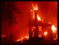
| 07/27/2005 01:13:04 AM |
DC Fire 1by ShannonComment: Very nice composition again. I like the red glow and the border is okay in this one. I would straighten the horizontal just a hair, but otherwise, I like it - good job. |
| Photographer found comment helpful. |
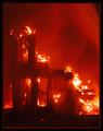
| 07/27/2005 01:12:06 AM |
DC Fire 3by ShannonComment: Again, I would ditch the border on this one. The one thing that bothers me most is the fact that the horizon isn't horizontal. Nice colors and detail. Cropped too tight in my opinion - I like the larger view shot much better. |
| Photographer found comment helpful. |
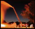
| 07/27/2005 01:10:34 AM |
DC Fire 2by ShannonComment: Cool shot - I like the composition. You've got some hotspots (pun intended) and blown highlights, and the focus could be a little sharper. Overall, still a good shot. (I would ditch the border - it's distracting IMHO.) |
| Photographer found comment helpful. |
Home -
Challenges -
Community -
League -
Photos -
Cameras -
Lenses -
Learn -
Help -
Terms of Use -
Privacy -
Top ^
DPChallenge, and website content and design, Copyright © 2001-2026 Challenging Technologies, LLC.
All digital photo copyrights belong to the photographers and may not be used without permission.
Current Server Time: 07/24/2026 10:44:00 PM EDT.