| Image |
Comment |
| 08/30/2005 02:24:14 PM |
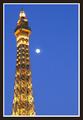
Faux Parisby marmalade1121Comment: Love the double entendre with "Faux Paris" and "faux pas"! Very clever. Great shot as well. The shot overall may be a bit bright for my personal tastes (but nothing that a little burning or reduction in backlighting couldn't address), but beautiful composition and color. I'm not crazy about the border, as I don't believe it really adds to the image, but I generally prefer no borders, so don't put too much relevance on that aspect. :-) Great shot.
EDIT: triple entendre... ;-D Message edited by author 2005-08-30 14:24:39. |
 Photographer found comment helpful. Photographer found comment helpful. |
| 08/30/2005 02:20:30 PM |
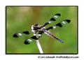
Dragonflyby loriprophotoComment: Okay, here's a prime example of what I've been trying to convey about the size and borders of your images. I can tell that this focus is spot-on perfect. The sharpness is great. But I just can't see enough of it, causing me to miss out on the full impact that such a beautiful shot can make. Sure, the twig has some blown highlights, but that's not something that a little burning couldn't fix and is moreover really not a factor with such a wonderful capture. I would strongly recommend utilizing the full 640 pixel maximum to show off your images to their fullest. You can add the border, copyright, and signature information to your printable images without losing the ability to show them as thumbnails separately. As is (IMHO - mind you), you are cheating yourself out of many viewers praise by limiting the breadth & depth of your truly great captures. You've got some great stuff here - show it off! Just my 2 cents... :-) |
| Photographer found comment helpful. |
| 08/30/2005 02:14:13 PM |
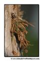
House of Twigsby loriprophotoComment: VERY cool photo! I've seen these little guys only a few times in my life, but they are amazing. Great DOF and focus. Composition is good too - as is the lighting. You might consider cloning or blending out the brighter areas of the background though - I think they take the viewer's eye away from the main subject matter. Great capture! |
| Photographer found comment helpful. |
| 08/30/2005 02:12:26 PM |
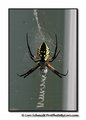
Garden Spiderby loriprophotoComment: Again, it's a size thing (yes, I know it's a unisex disease - lol). Don't know if your borders are consuming the balance of the 640 max pixel limit or if you are choosing to display slightly smaller images, but IMHO it is taking away from some very nice shots in your portfolio. Because of the smaller image size, the viewer can't appreciate all of the wonderful things you've captured! This particular shot being one of them. Great composition, tones, focus (from what I can tell), DOF, and composition - (the centered thing works well here). I just wish I could see him more closely. I also would suggest the black format of your borders for this shot. |
| Photographer found comment helpful. |
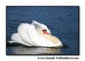
| 08/30/2005 02:08:35 PM |
Male Swan Being Agressiveby loriprophotoComment: Beautiful shot - and yes, these bad boys can be VERY aggressive! I like the off-center composition, but wish there was just a tad more space at the tail. You might also consider burning (at like -2) the whitest portions of the swan to get a little more detail out of the feathers. Great job! |
| Photographer found comment helpful. |
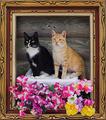
| 08/30/2005 01:57:28 PM |
Living Portrait In Wooden Frameby loriprophotoComment: Not being a big cat fan myself, I am surprised at how much I like this image. It's very creative and unique. I love the effects of the frame and 3D flowers. My only very minor criticism is that because the flowers appear to be so 3D, it makes the cats themselves seem much more 2D. And let me explain what I mean - I don't think it's the effect that's creating this, I think it's more the actual processing of the cats & background themselves. There appears to be marked edges around the cats that seem flat. Perhaps a very small amount of blending brush and/or shadows on the edges of the cats would help support the 3D effect already in place a bit more. Hope I don't sound like I'm just rambling (which I tend to do). Bottom line - very cool shot & a surprisingly (for me) appealing image. |
| Photographer found comment helpful. |
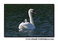
| 08/30/2005 01:50:24 PM |
Baby Swan On Mommas Backby loriprophotoComment: This is precious! We used to raise Polish Mute Swans on the lake where I grew up and I always loved seeing the cygnets catching a ride! A couple of minor observations and suggestions. I think a larger size version would allow the viewer to see and appreciate more detail. I also think the border is a bit too large (of course, I'm not always a real big border fan to start with). The only other thing is that you might consider a slightly different crop leaving more room at the top and one side (to take the main focus out of the dead center). Beautiful capture.
EDIT: I see that you seem to be trying to establish a specific border format style, so I amend my recommendation to say that I think black would server your purposes better for this particular shot. Just my opinion! :-) Message edited by author 2005-08-30 13:51:52. |
| Photographer found comment helpful. |
| 08/30/2005 01:47:30 PM |
Ridin' the Rails - circa 1920by saintaugustComment: Having recently shot some train photos, I think I've begun to appreciate the subject matter much more. This is great. Very good perspective and angle. Good composition and DOF. The only two things that bother me are that it looks like it has been through too much Neat Image (especially noticeable in the foreground) and the blown out sky. Still, it was a strong challenge entry and a great shot on its own (I scored it a 7). |
| Photographer found comment helpful. |
| 08/30/2005 01:44:47 PM |
divine freedomby saintaugustComment: Beautiful lighting and composition. Congrats on your 11th place finish and new PB! This is both a very tasteful and graceful shot. The only thing I really notice is that the hair on her shoulder looks a bit odd (perhaps processing remnants?). Still, very nice work. |
| Photographer found comment helpful. |
| 08/30/2005 01:42:44 PM |
laying geeseby saintaugustComment: Another storefront window? Very interesting stuff you're finding! Cool, unique, and very appealing (in an ew that's weird but I can't stop looking at it sort of way). Great composition and DOF. I like the blurred foreground model, as it really draws your eye to the one in focus. |
| Photographer found comment helpful. |
Home -
Challenges -
Community -
League -
Photos -
Cameras -
Lenses -
Learn -
Help -
Terms of Use -
Privacy -
Top ^
DPChallenge, and website content and design, Copyright © 2001-2026 Challenging Technologies, LLC.
All digital photo copyrights belong to the photographers and may not be used without permission.
Current Server Time: 04/16/2026 02:54:18 AM EDT.