|
|
|
Showing 7721 - 7730 of ~9565 |
| Image |
Comment |
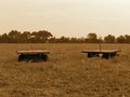
| 08/30/2005 09:15:10 PM | PICT2121.JPGby Buckeye_FanComment: Technically this is a very good shot. Aesthetically, it doesn't really appeal to me. The horizon line is almost exactly correct (only very very slightly off on my monitor), the focus is dead-on, and the chocolate/sepia tones are very appealing. It's just the subject matter... It's almost as if there were something on the wagons, it would be great; but since there isn't, it leaves the viewer wanting (and not in the good sense). Sorry, to be a downer, but I think there is a lot to be gained from this shot - exceptional tonal quality, sharpness, contrast, etc. :-) As a matter of fact, personally I think these are the types of images that we learn the most from. :-) |
| 08/30/2005 09:10:38 PM | lilacexplosion3.jpgby Buckeye_FanComment: This is awesome! I even like the border (which is saying a lot for me!). Beautiful symmetry with a realistic base. Very cool. |
| 08/30/2005 09:06:12 PM | Chihuly Walkwayby Buckeye_FanComment: So you're the one with the Chihuly stuff! I remember these shots well now. Cool! Glad I got back around to these - I thought they were very interesting.
This one in particular is unique in that it provide a great spectrum of color and shapes/lines, yet is confined to a finite space. Kind of ironic actually, in that I expect it to be completely free-flowing, yet it is confined by these man-made boundaries. i like it a lot and think it speaks to its viewers on a variety of emotional levels. Good job.
EDIT: Uncanny sharpness/focus - great capture! Message edited by author 2005-08-30 21:06:53. |
| 08/30/2005 08:59:14 PM | me2.jpgby lissylouComment: Great portrait, but as several have said already, I think you should lose the cord. That being said, I also think you could crop off a significant portion of the right-hand side of the image, so that your back closely parallels the edge of the frame. You have great posture and the image is quite able to stand on its own merits (so to speak). My personal take (albeit, that brings a whole discussion thread into the comment - LOL), is that you could bring down the overall lighting a tad to help improve contrast and bring out some of the richer, deeper tones & detail. Still, a very strong shot. |  Photographer found comment helpful. Photographer found comment helpful. |
| 08/30/2005 08:49:28 PM | Woman Ashamed of Her Own Nakednessby Buckeye_FanComment: Is this you? Whether it is or not, I must reiterate what I said before... This is a GREAT shot. VERY underrated in my personal opinion (I scored it an 8). I love the fact that the blindfold is the "color" of sin - red and that it hides the model's face from the perceived "sin" of the shot. I just thought this spoke on so many levels, it was extremely well thought-out and presented. I have to agree that the lighting is really the only short-coming of the shot. I wasn't exactly sure what it was keeping me from scoring it a 10, but that's it. Maybe a tad bit more contrast and dodge/burn brush (although I'm not trying to sound like a preacher for Heida and/or Joey - although I truly admire their talents!). This was a seriously great shot - took a lot of courage and fortitude to stick by, but in my humble opinion any qualms about it were shallow minds and the far too accepted anorexic viewpoint of beauty. In all honesty, it reminded me of a modern-day Renoir. | | Photographer found comment helpful. |
| 08/30/2005 08:42:08 PM | Spillby lissylouComment: Very cool idea. I think it lost something in the translation though. I'm not trying to be harsh, just honest. I love the idea of what I think you were trying to create based on the title, but the "ghost" images don't have enough of the tumble out of the box to make it realistic (if you know what I mean). They've got lots of "spill" but not enough of the transition from box to floor to make it plausible for the visually-oriented mind. I think you've got a great point of reference and starting point (good contrast, lighting, & color), but if you have some additional shots from this experiment, you might look for a version that contains more of this transition. Hope I'm making sense. | | Photographer found comment helpful. |
| 08/30/2005 08:03:44 PM | Beginningby AtroposComment: Fantastic shot. Truly spectacular composition and bokeh. The lighting and tones are rich and pleasing. Exceptional job. | | Photographer found comment helpful. |
| 08/30/2005 08:01:24 PM | God's Promiseby AtroposComment: What a spectacular, once-in-a-lifetime type of capture. Kudos. IF your original allows, I would like to see a little more of the landscape at the bottom - not much, just a bit more silhouetted. Otherwise, fantastic shot! | | Photographer found comment helpful. |
| 08/30/2005 07:59:34 PM | Ruling the Empireby KonadorComment: Wow! This shot blows me away. The tones, perspective, lighting, and composition are outstanding. Fantastic shot. Definitely a keeper (not that most of the shots in your portfolio aren't!). :-) | | Photographer found comment helpful. |
| 08/30/2005 07:57:59 PM | Bee Macro 2by KonadorComment: Fantastic clarity on this macro. But he's dead, isn't he? Trust me, it's no crime (unless you killed him - although I guess that's not technically one either!), I'm becoming a master of posing the dead things I find in the yard every day! LOL In all honesty, the pose does look a bit flat - only in that he doesn't look very lively. The detail, lighting, & color are dead-on (pun intended). [And please forgive me if this poor little guy was really alive and coherent when these shots were transpiring.] Bottom line - very good shot, but there does seem to be something intangible lacking. | | Photographer found comment helpful. |
|
Showing 7721 - 7730 of ~9565 |
Home -
Challenges -
Community -
League -
Photos -
Cameras -
Lenses -
Learn -
Help -
Terms of Use -
Privacy -
Top ^
DPChallenge, and website content and design, Copyright © 2001-2026 Challenging Technologies, LLC.
All digital photo copyrights belong to the photographers and may not be used without permission.
Current Server Time: 04/16/2026 06:42:25 AM EDT.
|