| Image |
Comment |
| 09/24/2005 12:49:02 AM |
marci 1.jpgby jpochardComment: I bet that this is one of the shots that the bride and groom (I assume that both are pictured here) feel is one of the best shots of the series. I say that because there is obviously a definitively happy emotion captured on both of their faces - not an easy accomplishment as a photographer. Exceptionally good shot IMHO. [Of course, I'm probably completely off-base, but I really am calling it as I see it!] |
 Photographer found comment helpful. Photographer found comment helpful. |
| 09/24/2005 12:45:13 AM |
Greenyby SchuffComment: I think you've got great natural color tones here, but the composition and focus don't do the subject justice IMHO. If you were to offset the bird and have a little sharper focus, I think that this image could really pop and have a much more lasting impact on the viewer. As it is, it is not a bad shot by any means, I just think that it could be better with a few minor tweaks. :-) |
| Photographer found comment helpful. |
| 09/24/2005 12:42:11 AM |
Alightingby Keith ManiacComment: I really like this shot. I can't help but be reminded of the Pixar short "For the Birds." Great flik & great shot. |
| Photographer found comment helpful. |
| 09/24/2005 12:37:24 AM |
supportby bucketComment: I LOVE the idea behind this shot (at least my interpretation of it)! You really captured an evidently personal bond between the two people and an emotively significant image to the viewer. I'm sure that there are those who would interpret all sorts of things based on the subjects' placement, but I personally feel that this is a strong statement of partnership. I like the use of B/W here too - it lends itself nicely to the male/female opposition, yet complimentary elements. |
| Photographer found comment helpful. |
| 09/24/2005 12:32:20 AM |
My Sunriseby SchuffComment: Nice capture of the layers of light. They can be so elusive to the camera, yet you managed to lasso them quite effectively. Beautiful tonal range too. |
| Photographer found comment helpful. |
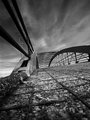
| 09/24/2005 12:30:38 AM |
Bridgeby Keith ManiacComment: What fantastic perspective and depth you have captured here! I really love the composition and tonal qualities of the shot. Beautiful lines and very visually appealing. Great job! |
| Photographer found comment helpful. |
| 09/24/2005 12:03:34 AM |
Moon 100% cropby srdanzComment: Lovely shot. Not sure that the 100% crop does it justice though. You have such incredible detail in the larger version, that I think a less severely proportional representation might preserve more detail, yet still provide a closer view. Currently, I think that this version loses quite a bit of detail in the translation. Just my two cents... It's a fantastic shot - either way you slice it - don't get me wrong! I just think that it is better a little further away. :-) |
| Photographer found comment helpful. |
| 09/23/2005 11:57:18 PM |
The Chef Specialby eugeneComment: As a fellow sushi lover, I can completely appreciate the subject matter's appeal. However, I think that the DOF and lighting in this particular shot detract from the otherwise very artistically attractive and appetizing characteristics of sushi.
There is a dull purple overtone to the whole image that is not only unappetizing, but detracts from the "wholesome" aspects of natural food. Also, the DOF is too shallow to allow the viewer to fully appreciate the intricate details inherent in any sushi roll - especially one with fish eggs.
I think that with more "white" reflected light and a deeper DOF, you could present this dish in a much more appealing manner. IMHO, whenever you photograph food, lighting is absolutely key. Not that I'm any expert on lighting - by any means - but I do know that in order to make something look appetizing, it has to have a certain color tone/glow about it.
Hope that my opinion was helpful... |
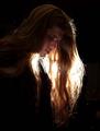
| 09/23/2005 11:50:00 PM |
Brother Rockby taterbugComment: I really like the idea here - he certainly has the "air" needed for rock stardom! I think the strongest aspects of this shot are the artist and the backlighting. I think the weakest aspects of this shot is the overall lighting. IMHO, you needed some additional frontal/side lighting to provide some depth to the image. The hair is great - although there are some blown highlights there that I think with additional lighting would be minimized. I'm certainly no lighting expert (by any means), so would defer to some others on this site for advice on how to fix it, but I do think I can recognize the areas that could use some improvement. Again, I think this is a great idea and a strong subject; it just needs a little more umph. |
| Photographer found comment helpful. |
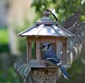
| 09/23/2005 11:42:22 PM |
Blue Jayby srdanzComment: Pretty good composition here - I like the mourning dove in the background. You might consider moving the main subject out of the dead center though. There are a couple of blown out hot spots too and the focus is not quite tack sharp, but there is still a lot of merit to the shot IMHO. You've got good natural color tones and a very nice bokeh. Despite the shot's flaws, it is still very appealing visually - which to me means, that you have a very good eye for capturing "a moment". This is a rare and unique talent that is not doled out frequently. |
| Photographer found comment helpful. |
Home -
Challenges -
Community -
League -
Photos -
Cameras -
Lenses -
Learn -
Help -
Terms of Use -
Privacy -
Top ^
DPChallenge, and website content and design, Copyright © 2001-2026 Challenging Technologies, LLC.
All digital photo copyrights belong to the photographers and may not be used without permission.
Current Server Time: 04/30/2026 04:16:42 PM EDT.