| Image |
Comment |
| 09/26/2005 12:03:34 AM |
Up by Joey LawrenceComment: Damn dude - this is becoming a habit! LOL Great job! Knew this would ribbon bigtime! WTG! |
 Photographer found comment helpful. Photographer found comment helpful. |
| 09/25/2005 05:19:02 PM |
Metal12by JayWalkComment: My first impression is that there are a lot of rich textures here... My second impression is that the line of "rusted" metal at the top is a distraction - then after a few seconds, I decide that I kinda like it. Very visually appealing composition. Deep textural values and tonal contrasts really add to the overall impact of the image. A lot of abstract appeal as well. I really like it. (Not trying to sound too esoteric here - just speaking my mind! Cool stuff!) |
| 09/25/2005 05:12:57 PM |
Croc.by JayWalkComment: Very cool shot. I'm guessing that you did a lot of burning here - just a hunch. The deep rich tones at the bottom of the croc's mouth seem to be juxtaposed to the tones on the surface of the croc's back. Excellent job on the detail and eyes especially. Looks like you made the absolute best of a difficult lighting situation. Really outstanding shot. Nice work. |
| 09/25/2005 11:26:48 AM |
|
| Photographer found comment helpful. |
| 09/25/2005 11:25:37 AM |
|
| Photographer found comment helpful. |
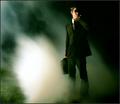
| 09/25/2005 11:23:49 AM |
Men In Black Agentby Joey LawrenceComment: Great job Joey! Congrats on another ribbon! WTG! (I thought this might be you...) This shot really stood out in the crowd. |
| Photographer found comment helpful. |
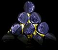
| 09/24/2005 06:53:06 PM |
Zincby CEJComment: I scored this a 9. Really great job. Love the texture and lighting. Nice composition too. |
| Photographer found comment helpful. |
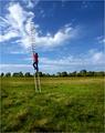
| 09/24/2005 01:00:49 AM |
Reach for the Skyby taterbugComment: I think this has great lines and symmetry. I also really like the blues in the shot. I'm not crazy about the red overtones though. You've got great detail in the red portions of the building and the clouds of the sky, so I would try to capitalize on all of those elements. |
| Photographer found comment helpful. |
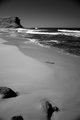
| 09/24/2005 12:57:32 AM |
Garie-1-DPC.jpgby pgattComment: This is really a superior image! So fluid and well composed. I think I understand what other commenters are saying about wanting to see it in color, but I think I like it as is in B/W. I also don't think it's missing anything as far as a focal point goes - it has plenty of subject matter upon which to focus IMHO. My only complaint would be that it's cropped a little too loosely on the bottom - I would recommend cropping so that only one rock is visible. I think that this solves a number of issues raised by other commenters and provides the same perspective (yet only slightly different) of the beach. Just my 2 cents... |
| Photographer found comment helpful. |
| 09/24/2005 12:51:21 AM |
Baby Bugs!by SchuffComment: Fantastic capture! I would like to see a tighter crop. He's/She's such a cutie! Looks like great bokeh too (but not as effective with the given crop). Very cool capture. |
| Photographer found comment helpful. |
Home -
Challenges -
Community -
League -
Photos -
Cameras -
Lenses -
Learn -
Help -
Terms of Use -
Privacy -
Top ^
DPChallenge, and website content and design, Copyright © 2001-2026 Challenging Technologies, LLC.
All digital photo copyrights belong to the photographers and may not be used without permission.
Current Server Time: 04/30/2026 04:16:59 PM EDT.