DPChallenge: A Digital Photography Contest You are not logged in. (log in or register
 
Browse Settings
Currently viewing:
Registered UserSJCarter

Show comments:

Per page:

Order:

Comments:


Comments Made by SJCarter
Pages:   ... [666] [667] [668] [669] [670] [671] [672] ... [957]
Showing 6681 - 6690 of ~9566
Image Comment
Pink Kalanchoe #2
11/07/2005 07:32:03 PM
Pink Kalanchoe #2
by GentleSoul

Comment:
You're giving that super macro setting a workout, but it's paying off! Good job. I think this one could use a bump in color and some burning to lose the washed out/blown out areas, but otherwise nice shot.
Photographer found comment helpful.
Pink Kalanchoe #4
11/07/2005 07:30:32 PM
Pink Kalanchoe #4
by GentleSoul

Comment:
Not quite as strong as your other one, but still a great shot! (This is a good series.) The focus and shallow DOF work really well. The colors seem a little muted/washed out - you might consider burning a bit to deepen the hues/make them richer. Beautiful shot.
Photographer found comment helpful.
Pink Kalanchoe #1
11/07/2005 07:28:39 PM
Pink Kalanchoe #1
by GentleSoul

Comment:
WOW! Fantastic focus & DOF! Beautiful color tones too. The composition may be a tad cramped, but it's hard to criticize anything about this shot. Great work!
Photographer found comment helpful.
Small egg
11/07/2005 07:17:25 PM
Small egg
by toti

Comment:
*Greetings from the Critique Club*

First let me say congratulations on such a strong entry. Great score and finish (well deserved).

Composition
I love minimalism, so this approach wins me over big time. Obviously, voters appreciate it as well. At first I thought the image might be too tall, but after looking at it for a while I've changed my mind. Perfect spacing of the egg and shadow from the bottom right corner.

Lighting
Wow... Couldn't be better. Love the encroaching shadow in the upper left - really adds depth to the shot. The shadow on the egg is nice and strong too. You got great brightness without blowing everything out on the background and egg too. I like the slight warm yellow tinge of color in the shadow too, although some purists may have interpreted this as straying from the "white" thing.

Overall
The focus is tack sharp - and has to be to pull this off. I can find very little that I would change about this shot. It's beautiful. I'm actually surprised it didn't score and finish higher than it did. I'd certainly be proud to have it in my portfolio. Great job.

Just my 2 cents...

Message edited by author 2005-11-07 19:19:54.
Green Room
11/07/2005 07:00:45 PM
Green Room
by philup

Comment:
*Greetings from Critique Club*

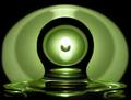
First, let me say that I think the image is very appealing visually and has a lot to offer the viewer from an abstract perspective. Second, I think your score probably suffered quite a bit because people couldn't distinguish exactly what it was and therefore couldn't necessarily tie it into the transparency challenge theme. (Just my opinion and supposition.)

Composition
I really like the lines and fluidity of the image. The surfaces also seem to lend themselves to the abstract nature well. There do appear to be some issues with the left sides of the curved objects (PP remnants?) that are a little distracting, but not that noticeable. Very interesting and appealing...

Focus
I think that the focus, while good, could have been a tad sharper. To pull off this high-tech/industrial/sharp/clean artistic shot, I think the focus has gotta be dead on. There appears to be a little static noise in the image, still it's good.

Lighting
I think you're lighting is great. Obviously, lighting is a key element of your subject matter here and I think you pulled it off nicely. You've got great reflections, tonal ranges, and no real hot or overly blown out areas. I like the green coloration too.

Overall
I like it and think it is a much better shot than the score it received. Good stuff and I continue to look forward to more of your work. (You've got some great shots in your portfolio!)

Just my 2 cents...
Photographer found comment helpful.
Little house on the left
11/07/2005 03:57:38 PM
Little house on the left
by RulerZigzag

Comment:
Excellent job of establishing a mood with your composition and lighting. Cool shot.
Photographer found comment helpful.
Chosen one
11/07/2005 03:56:40 PM
Chosen one
by RulerZigzag

Comment:
Lovely shot. The object in the middle at the top is a little distracting, but love the warm lighting and shadows.
Bird in Distance
11/07/2005 03:53:33 PM
Bird in Distance
by RulerZigzag

Comment:
Nice tones. Almost want to be closer, but realize that would take away from the impact of the sky. Cool shot.
Stairway to Hell
11/07/2005 03:49:41 PM
Stairway to Hell
by RulerZigzag

Comment:
Really like the symmetry here. The juxtaposed up/down elements and graffitied walls are great. Good eye.
Photographer found comment helpful.
Cory Smith
11/07/2005 03:48:38 PM
Cory Smith
by CalliopeKel

Comment:
Great capture! Love the windswept hair and the intense stare. Perfect lighting and composition.
Photographer found comment helpful.
Pages:   ... [666] [667] [668] [669] [670] [671] [672] ... [957]
Showing 6681 - 6690 of ~9566


Home - Challenges - Community - League - Photos - Cameras - Lenses - Learn - Help - Terms of Use - Privacy - Top ^
DPChallenge, and website content and design, Copyright © 2001-2025 Challenging Technologies, LLC.
All digital photo copyrights belong to the photographers and may not be used without permission.
Current Server Time: 09/21/2025 03:31:31 AM EDT.