| Image |
Comment |
| 04/21/2006 12:35:12 PM |
Two Candlesby tonyvComment: I scored this a 6 during the challenge. Love the lighting and shadows. The perspective is cool too. The subject and backdrop are what are less interesting to me in this shot. Could just be my personal taste, but it didn't jump out and grab me. Still an interesting and creative study. |
 Photographer found comment helpful. Photographer found comment helpful. |
| 04/21/2006 12:32:44 PM |
|
| Photographer found comment helpful. |
| 04/21/2006 12:31:28 PM |
Rope and Seaby TuckersmomComment: Love all the elements of this shot - beautiful editing. Not crazy about the composition/crop. The centered post is distracting - almost want it to one side. Still, VERY interesting and appealing shot. |
| Photographer found comment helpful. |
| 04/21/2006 12:29:44 PM |
|
| Photographer found comment helpful. |
| 04/21/2006 12:27:06 PM |
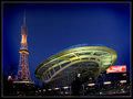
Modern Marvelsby RikkiComment: Great composition & color! The processing really adds a lot too (especially the gradient). Not crazy about the person in front, but still very nice work. |
| Photographer found comment helpful. |
| 04/21/2006 12:22:18 PM |
DSC_0841.jpgby nomad469Comment: I agree with Itsimring. Absolutely beautiful model, composition, & lighting. The only real distraction is that the left side of her face (most particularly her eye) is oof. Otherwise, top notch shot. |
| Photographer found comment helpful. |
| 04/21/2006 11:25:03 AM |
J.E. Band 4by GivemeashotComment: Again, I like the location and poses. The OOF is a distraction though and the lighting just doesn't seem to want to cooperate with you. It's too bright or too dark! (I HATE THAT!) ;-) You might consider cropping more off the bottom of this one - the foreground street serves no real purpose (as it's evident where they are) and it would move the viewer closer to the subjects. And I would make sure with my crop that I'm not cutting off any lettering - it doesn't look clean. Either clone out the portions you don't want or crop them off. Just my $0.02... Message edited by author 2006-04-21 11:26:10. |
| Photographer found comment helpful. |
| 04/21/2006 11:22:24 AM |
J.E. Band 12by GivemeashotComment: I didn't care for this one at first, but it's grown on me. I really like the processing and the crop works. It's still a little too dark, but I think you're on the right track here. |
| Photographer found comment helpful. |
| 04/21/2006 11:21:18 AM |
J.E. Band 2by GivemeashotComment: I like the backdrop and blue sky, but it seems awfully centered. The "up" angle is also good. Sun is too bright - see harsh shadow on left guy's face and glare on white shirt? Plus, they're all squinting. This would be a great location to reshoot though... At a different time of day and with the cross off to one side. |
| Photographer found comment helpful. |
| 04/21/2006 11:18:42 AM |
J.E. Band 1by GivemeashotComment: I think this one is pretty good. I'd actually zoom in a bit closer though and lose more of the left. :-) The guy in the back with his head turned is a little distracting, but maybe he is too - lol! |
| Photographer found comment helpful. |
Home -
Challenges -
Community -
League -
Photos -
Cameras -
Lenses -
Learn -
Help -
Terms of Use -
Privacy -
Top ^
DPChallenge, and website content and design, Copyright © 2001-2026 Challenging Technologies, LLC.
All digital photo copyrights belong to the photographers and may not be used without permission.
Current Server Time: 05/09/2026 03:05:42 AM EDT.