| Image |
Comment |
| 06/27/2006 01:55:55 PM |
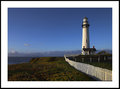
DPC2157.jpgby mpetersComment: What a strong composition! WOW... The leading lines of the white fence into the white lighthouse are terrific. VERY nice work. |
 Photographer found comment helpful. Photographer found comment helpful. |
| 06/27/2006 01:54:50 PM |
Kristen IIby KatmystiryComment: Great shot! Love the lighting here - except for the shadow (although it's not too distracting). I found that having the model stand further away from the backdrop prevents the shadow from appearing. Ya know... The shadow may be all right after all - it's growing on me. You can probably remove it via PP if you want to invest the time and energy too (I've done that many times before, but it can be a lot of work - LOL). This is really nice as is. Good job. |
| Photographer found comment helpful. |
| 06/27/2006 01:51:37 PM |
S m i l eby CalliopeKelComment: Wonderful capture of emotion and I really like the soft color tones. It seems a bit tilted to me, but I can also see where this might be a conscious artistic decision. This whole series is good. |
| Photographer found comment helpful. |
| 06/27/2006 01:50:22 PM |
by rscorpComment: This is really cool. Such an awkward looking pose at first, but as you view the shot it relaxes into a very natural composition. Good use of B/W-duotone too. Nice work. |
| Photographer found comment helpful. |
| 06/27/2006 01:48:44 PM |
Kyleighby KatmystiryComment: I like this, but it almost seems too bright. Your highlights aren't blown out or anything, it just appears to be too much light for the shot. Could be me... I've been looking at my dark images for so long now - LOL! I'd be curious to see how this looks as B/W with the contrast turned up. I think it could work well high-key. |
| Photographer found comment helpful. |
| 06/27/2006 01:43:23 PM |
DPC2132.jpgby mpetersComment: Beautiful! Boy, these lighthouse shots ROCK! The foreground may be a tad on the dark side, but the sky more than makes up for it. Very nice. |
| Photographer found comment helpful. |
| 06/27/2006 01:42:04 PM |
abstract colorby Jaded_HousewifeComment: This is cool. I like the colors and composition. Not sure about the shadowy images around the light fixture, but they do add more color. Nice work. |
| Photographer found comment helpful. |
| 06/27/2006 01:39:14 PM |
DPC2090.jpgby mpetersComment: WOW!!! This is gorgeous! Love the almost painted colors. Beautiful composition too. Well done. |
| Photographer found comment helpful. |
| 06/27/2006 11:44:35 AM |
|
| Photographer found comment helpful. |
| 06/27/2006 12:29:14 AM |
curves1.jpgby librodoComment: I like this one as well, but the skin tones on her backside seem like they might be little too bright? I'd almost prefer to see that portion of her body's skin toned down a hair - more the same color as the rest of her. Still a very beautiful shot. |
| Photographer found comment helpful. |
Home -
Challenges -
Community -
League -
Photos -
Cameras -
Lenses -
Learn -
Help -
Terms of Use -
Privacy -
Top ^
DPChallenge, and website content and design, Copyright © 2001-2026 Challenging Technologies, LLC.
All digital photo copyrights belong to the photographers and may not be used without permission.
Current Server Time: 05/09/2026 03:51:58 PM EDT.