| Image |
Comment |
| 03/17/2007 08:32:17 AM |
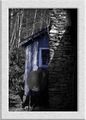
the Hiddenby LegatoMuzicComment: frame overwhelms image - doesn't leave me enough to see. Understand selective desat choice though not sure I would have made it. Grain not strong enough to have impact. |
| 03/17/2007 08:30:33 AM |
Quack Quackby RitaDComment: grain not apparent enough to make an impact on the image. good picture of a cormorant though. |
| 03/17/2007 08:29:42 AM |
|
 Photographer found comment helpful. Photographer found comment helpful. |
| 03/17/2007 08:28:08 AM |
Flairby TuckersmomComment: grain may be a little too subtle but the tones in this are excellent. |
| Photographer found comment helpful. |
| 03/17/2007 08:26:58 AM |
The Moment Before I Walk Down The Isleby PurpleKComment: dislike the border but I like the softness and subtle tones. border is dark enough to distract from and overwhelm the focus of the image so it becomes the focus. composition and lighting well done. |
| 03/10/2007 07:58:14 AM |
|
| 03/10/2007 07:57:11 AM |
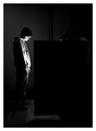
Night Lightby SherwinJamesComment: I like this for the clean lines and hues. Kind of emotionless but the crop works really well to add some tension. 8 |
| Photographer found comment helpful. |
| 03/10/2007 07:56:59 AM |
Why? ! by John WhiteComment: perfect choice of hue - its striking. contrast well done. Something in the balance just seems slightly off but I can't put my finger on it. 8 |
| 03/10/2007 07:55:17 AM |
|
| Photographer found comment helpful. |
| 03/10/2007 07:53:54 AM |
|
| Photographer found comment helpful. |
Home -
Challenges -
Community -
League -
Photos -
Cameras -
Lenses -
Learn -
Help -
Terms of Use -
Privacy -
Top ^
DPChallenge, and website content and design, Copyright © 2001-2026 Challenging Technologies, LLC.
All digital photo copyrights belong to the photographers and may not be used without permission.
Current Server Time: 07/23/2026 01:40:10 AM EDT.