| Image |
Comment |
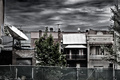
| 01/22/2009 08:14:46 PM |
Desolation Rowby Covert_OddityComment: I think the HDR works here. If its not, you got some wild a$$ clouds where you live. But I think that enhances the scene - its not overused and its applied well. The tree kind of stops me from entering the image - its like a big road block, but what are you going to do? I like the balance of the round white dish with the rectangular 'white' roof - find it intriguing and it raises my interest in the image. 6 |
 Photographer found comment helpful. Photographer found comment helpful. |
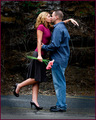
| 01/22/2009 08:12:29 PM |
Cultural exchangeby PaulEComment: Cute moment, well timed, excellent colors and depth of field. Not much interest for me but it is well taken. 6 |
| Photographer found comment helpful. |
| 01/22/2009 08:09:16 PM |
The Bluesby sir_bazzComment: Somehow I like this. It is almost absurd, but the color palette really pulls it back and adds a sense of playfulness. Well focused too. 8 |
| Photographer found comment helpful. |
| 01/22/2009 08:07:09 PM |
The Kissby TonyTComment: Cute scene. Don't like the color fo the frame (distracting) but I do think the vignette helps the image. Great sharpness and good toning/colors. 6 |
| Photographer found comment helpful. |
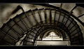
| 01/22/2009 08:06:02 PM |
P e r s e v e r a n c eby phloverComment: I like the black and white conversion here. I think the rigidity of the frame fights with the fluidity of the stairs and works hard to compress the image. I wish the DOF was a little greater, even at the risk of introducing a little grain. |
| Photographer found comment helpful. |
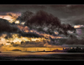
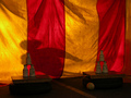
| 01/22/2009 08:03:49 PM |
...And nature, from a simple recipe, has brewed a cup whose strength has dizzied me...by Bear_MusicComment: Nice picture of a cloud. Or at least, that seems to be subject. I fell perfectly ambivalent about this image, which is rare for me - usually I don't like something or really like something. Maybe the frame is distracting me, as its weight at the top fights with the cloud for attention. Mixed in the cloud is a beautiful purple tone - would have loved to see that highlighted. 6 |
| Photographer found comment helpful. |
| 01/22/2009 07:59:23 PM |
Jenby chesireComment: My first thought is why is she standing there almost naked? Course, I've done a few of these myself so I have no room to question. So I move on and notice there is not much of a depth of field, which detracts a little from the image. She is posed excellently, but the colors are not strong enough to keep my interest. Even if going for subtle coloring, there is no continuity (relationship) between the tones so it doesn't feel restful. |
| Photographer found comment helpful. |
| 01/22/2009 07:56:06 PM |
Phantomby tangueraComment: Street carnival. Your timing was great for the lighting but I don't think the shadow is interesting enough to sustain more than a couple of seconds of viewing. |
| Photographer found comment helpful. |
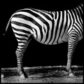
| 01/22/2009 07:54:10 PM |
ARTby gocComment: Thoroughly amusing and, the longer I look at it, the more I question the zebraness of the subject. Maybe its really an ass, purposefully painted to fool zoo goers. The toning works perfectly and the crop pushes this towards the sublime. 10 |
| Photographer found comment helpful. |
| 01/22/2009 07:51:24 PM |
|
| Photographer found comment helpful. |
Home -
Challenges -
Community -
League -
Photos -
Cameras -
Lenses -
Learn -
Help -
Terms of Use -
Privacy -
Top ^
DPChallenge, and website content and design, Copyright © 2001-2026 Challenging Technologies, LLC.
All digital photo copyrights belong to the photographers and may not be used without permission.
Current Server Time: 07/17/2026 10:33:47 AM EDT.