| Image |
Comment |
| 06/28/2005 03:50:46 PM |
Sundial Bridgeby RikkiComment: beautiful, simple, right to the point. :) color, focus, DOF, POV, composition, dead on. 10 from me, good luck in the challenge! |
 Photographer found comment helpful. Photographer found comment helpful. |
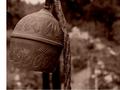
| 06/28/2005 03:15:54 PM |
Bell in the rosesby RonceComment: Not sure what the white on the left is for. I like the DOF, POV. Detail, focus, clarity well done. Haven't decided on the crop /composition yet. Not sure if I would like it better on the right or not as the rope cuts the image in half. |
| Photographer found comment helpful. |
| 06/28/2005 03:14:00 PM |
Circa 1920by loveComment: High definition - pretty cool macro. People might mistake it for a manhole cover or something. ;) I like the composition and the contrast. |
| Photographer found comment helpful. |
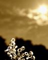
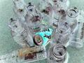
| 06/28/2005 03:11:49 PM |
Flamesby RoosterComment: Interesting. Like the color tones used. Wish there was more to the bottom of the image - the nuts appearing out of nowhere don't give me (or them) a base - it makes the image seem truncated (like standing people without feet). I don't mind the noise but others will probably comment on it. Think the lighting is well done. |
| Photographer found comment helpful. |
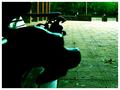
| 06/28/2005 03:09:04 PM |
The race is about to begin.by swamimetalanandaComment: Title referring to the dragons? Very interesting image. I like the POV. Unfortunately, the lack of light and short DOV rendered the closest dragon a blob. A way to fix this so the dragon is more easily recognizable is to move further away and zoom in on the two dragons. If you have a little extra frame you can always crop it. Focal compression technique would also be useful here - it would move the dragons closer together so to speak, enabling you to have a shorter depth of field. |
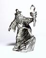
| 06/28/2005 03:01:51 PM |
Pewter wizardby speaseComment: I think this image would have been greatly enhanced with a blue background. The white competes with the highlights, making the entire image washed out. |
| 06/28/2005 02:56:20 PM |
It's not easy bein' Aluminumby theskitch6Comment: The composition is interesting but I really don't care for the coloration effect. I don't think it adds to the image as a whole. B&W may work. |
| Photographer found comment helpful. |
| 06/28/2005 02:54:53 PM |
Praying on a Sunny Afternoonby islandchild1988Comment: Interesting take on the challenge. The focus is soft - thinking it is hand shake from not enough light. The window makes the background too light (blown highlights). Maybe a lower point of view would make for a more interesting composition and cut some of the glare from the window. |
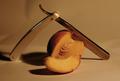
| 06/28/2005 02:52:28 PM |
Razorsharpby FridrikComment: The color cast really detracts from this image. Using levels would help that I think. The image itself is in focus and composed in an interesting fashion. |
| 06/28/2005 02:51:15 PM |
Raining on my Grillby mleeComment: Pretty cool, but it looks like the water is the main subject. Like the imag ethough. Maybe a slightly great DOF would improve it. POV is excellent. |
| Photographer found comment helpful. |
Home -
Challenges -
Community -
League -
Photos -
Cameras -
Lenses -
Learn -
Help -
Terms of Use -
Privacy -
Top ^
DPChallenge, and website content and design, Copyright © 2001-2026 Challenging Technologies, LLC.
All digital photo copyrights belong to the photographers and may not be used without permission.
Current Server Time: 07/22/2026 09:14:42 PM EDT.