DPChallenge: A Digital Photography Contest You are not logged in. (log in or register
 
Browse Settings
Currently viewing:
Registered Userdahkota

Show comments:

Per page:

Order:

Comments:


Comments Made by dahkota
Pages:   ... [230] [231] [232] [233] [234] [235] [236] ... [350]
Showing 2321 - 2330 of ~3496
Image Comment
protective limbs
09/14/2005 12:05:30 AM
protective limbs
by mesmeraj

Comment:
Unbelievable. I thought this was top 5 at least. What the heck do I know anymore?
Photographer found comment helpful.
Branching Out
09/14/2005 12:04:18 AM
Branching Out
by bucket

Comment:
In this group, I would have expected this much much higher. Just goes to show you I have no clue... Thought this was great BTW.
Photographer found comment helpful.
Chairman of the board
09/13/2005 10:45:10 AM
Chairman of the board
by Chez

Comment:
Beautiful image and excellent lighting. Wish you had left a hair more room at the top. :) 8
Photographer found comment helpful.
The Hustler
09/12/2005 08:57:21 AM
The Hustler
by Hokahey

Comment:
Amazingly underrated image. I had this in my top 3.
Photographer found comment helpful.
Morning Trap
09/12/2005 08:49:12 AM
Morning Trap
by LeeD

Comment:
How did this end up down here? I gave you an 8 for what its worth and expected this to place much higher. Something about this image is both peaceful and jarring at the same time. Maybe the rake coming from almost the exact center. Like the hand of time around the clock.
Photographer found comment helpful.
Dark and Light
09/11/2005 11:11:56 AM
Dark and Light
by davidus428

Comment:
Greetings from the Critique Club!

Thank you for including your camera information. It helps!

There are some things to consider when taking a picture: Composition, tonal balance, focus, lighting, POV, DOF.
The composition of the image is centered. While I enjoy centered compositions, I don't think it fits the subject in this case. I understand you might be trying to balance the blacks and whites, but I don't think the extra space on the right contributes to the image.
Tonal Balance - your blacks and whites are very well done but there seems to be very little middle ground. I think you lose some detail due to this.
Focus - The focus is good - should be at F20, but unfortunately the extra stops cost you shutter speed which resulted in motion blur. In many cases motion blur works great in an image but I don't feel this is one of them.
Lighting - the lighting works in the image but seems a tad harsh, though i can't really tell if it is the lighting or the processing.
POV - Point of view is excellent.
Depth of Field - The DOF is excellent. You've captured the ants and stick sharply (with the exception of motion blur) and gotten a very nice blur for the background.

I think the framing works for this image.

I'm a fan of high contrast images. I think though, in this instance, you've lost important detail, the gradations of black that might be apparent if you toned it down just a hair. What's amazing is that I can see the hair on the ants - I know the detail is there.

If you have any questions or comments, please do not hesitate to PM me.
Photographer found comment helpful.
Beauty Is In...
09/11/2005 10:37:25 AM
Beauty Is In...
by Tranquil

Comment:
I would blur out the rest of the eyebrow to keep the emphasis on the eye. I'm drawn to the blood shotness (is that a word?) of the eye and the yellow spot in the eye. I would reduce both if possible to get viewer's focus on the pupil and iris. I love the treatment you did - the fade out. It works very well for this image. POV and focus excellent as are colors.
Photographer found comment helpful.
Divine Leviathan
09/11/2005 07:51:02 AM
Divine Leviathan
by KitKat

Comment:
Greetings from the Critique Club!

When requesting critiques on images, please include all shooting information possible (aperture, ISO, shutter). This will enable the critiquer to respond with a more in depth critique.

Since I do not know anything about the conditions in which you took this image, this critique will not be able to touch on that. When taking an image, there are certain things to take into consideration: Composition, lighting,tonal balance, point of view, depth of field, focus.
Composition: I think the composition works in this image. Some argue for a less centered composition but I'm not sure that would serve the image well. I like the space this composition provides. If you expanded the image to include more on the top and right, the subject would be smaller and I think that would detract at this size. However, when printing at a larger size, you might consider that.
Lighting: I think the lighting works. It provides depth, giving highlights to the water.
Tonal balance: The image is a little flat due to lack of contrast. This could easily be fixed in any editing SW. Currently, the image looks slightly foggy - a bump in contrast would remedy this.
Point of View: The point of view works for this image.
Depth of field: everything that needs to be in focus in this image is. Since I do not know your shooting conditions, I cannot comment on any adjustments you might have made.
Focus: Focus works for subject

I think your stop action capture was well done and well timed.

With regard to the challenge:
As one voter said, they knocked you down a point for the title. You will always have voters like this and there were probably dozens more who did the same thing. To score higher, follow the challenge rules exactly. It mentioned D&L; I would have found something that was D&L. Not saying that's the best thing for the image, just a method to achieve a higher score. A bump in contrast would also achieve a higher score. DPC voters prefer contrasty images: blacks and whites (notice the number of comments that referred to black and white). I don't think that this image would be improved in B&W however. The blues tones really work here. I think the two suggestions here would have given your score a .5+ boost.

If you have any questions or comments regarding this critique, please do not hesitate to PM me.

Death & Life
09/11/2005 07:30:31 AM
Death & Life
by Kathe

Comment:
Greetings from the Critique Club!

Typically, this is not my preference for image styles. Not a problem with the image at all - just a personal choice. Just wanted to let you know that so you don't wonder why I do not critique this on subject matter.

When capturing an image, there are some important things to pay attention to:
Composition, lighting, tonal balance, focus, depth of field, point of view.
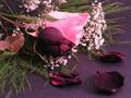
Composition: For the subject, this composition works. The placement of the various elements allows the eye to wander around the photograph. I would argue that it is cropped too tightly, that the subject does not have breathing room, but different people prefer different spaces so its a personal choice.
Lighting: The lighting works for the subject, providing enough shadow to give depth but not enough to be distracting.
Tonal Balance: The image seems to be off - too far into the reds/magentas, to allow the veiwer to be comfortable. The blacks are black but the whites aren't white - they're pink. This only throws one off as everything else has the same pink tint. It would be easily fixed by rebalancing the whites away from the reds.
Focus: The focus here is soft. I've looked through the entire image and I can't find any part in sharp focus so I am going to assume it is camera shake that cause it. At 1/13 of a second, this is a distinct possibility. If you were going for soft focus effect, one of the better ways to achieve that is the make the image more out of focus and choose softer lighting conditions. The lighting here is a bit to harsh for soft focus.
Depth of Field: The depth of field here seems on target for the subject. You have a nice blurring at the bottom left edge of the image. I would argue that maybe even a shorter DOF would also work. Seeing that you took this at 3.2, I'm not sure you would have been able to achieve this.
Point of view: I think POV works for this image. You've angled the shot slightly, not taking it head on, adding depth to the image.

With regards to the challenge: This image scored around the middle of the challenge. Not too bad considering. To redo the shot? Your choice. But what may have scored better, solely in my opinion? DPC voting favors simplicity. The added greenery and baby's breath, while looking nice, is not integral to the image. The two roses, by themselves would be a much more powerful image. DPC voters love black backgrounds. The purple background used has good texture in my opinion but the votes probably would have been higher with a flat background (prefereably black). Not saying this is a better way to create your image, only providing information on how to score higher with DPC voters.

Hope the critique provided is helpful. If you have any questions or comments, please do not hesitate to PM me.
Photographer found comment helpful.
Metal Green Woodland
09/09/2005 09:13:19 AM
Metal Green Woodland
by La Vista

Comment:
I would have liked more contrast but I really like hte tones used. The composition is odd but I have no idea what was at the bottom. Creative take on the challenge.
Photographer found comment helpful.
Pages:   ... [230] [231] [232] [233] [234] [235] [236] ... [350]
Showing 2321 - 2330 of ~3496


Home - Challenges - Community - League - Photos - Cameras - Lenses - Learn - Help - Terms of Use - Privacy - Top ^
DPChallenge, and website content and design, Copyright © 2001-2025 Challenging Technologies, LLC.
All digital photo copyrights belong to the photographers and may not be used without permission.
Current Server Time: 09/16/2025 10:39:35 AM EDT.