| Image |
Comment |
| 05/06/2006 11:52:46 AM |
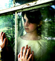
Light and shadowby MelethiaComment: like the play of light and shadow. Image feel slightly off balance but not sure why. toning echo well done. 7 |
 Photographer found comment helpful. Photographer found comment helpful. |
| 05/06/2006 11:51:56 AM |
|
| Photographer found comment helpful. |
| 05/06/2006 11:51:13 AM |
|
| Photographer found comment helpful. |
| 05/06/2006 11:50:31 AM |
|
| Photographer found comment helpful. |
| 05/06/2006 11:47:43 AM |
Seed by MudHutComment: strong compositionally. would like just a touch more contrast. flows with interesting lighting. 8 |
| Photographer found comment helpful. |
| 05/06/2006 11:47:01 AM |
White on White: Egret Displaysby sfaliceComment: back and forth on this one. strong graphic elements but the composition is a little weak. or is it the colors? none-the-less, interesting. 8 |
| Photographer found comment helpful. |
| 05/01/2006 08:42:56 AM |
daydream by CalliopeKelComment: Well deserved - It should have come sooner! Excellent concept and follow through. |
| Photographer found comment helpful. |
| 04/29/2006 08:11:38 AM |
Picasso Jr. (Picasso by Irving Penn)by gsalComment: Wow. I can't believe I didn't mark this as a favorite when I first saw it. Must have been in a hurry. Still in love with this. It proves that you can completely ignore the 'rules of composition and lighting' and produce an amazingly wonderful emotive image. Maybe I love it because it breaks the rules - I'm not a rules gal anyway. Geez I love this image. Well done. |
| Photographer found comment helpful. |
| 04/19/2006 12:33:18 AM |
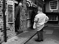
At the Butcher'sby e301Comment: Okay, I'll say it, you was robbed. This should have been first. So, what happened next? Are you going to make me buy the book? :) |
| Photographer found comment helpful. |
| 04/18/2006 07:08:31 AM |
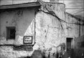
Houseby alexgarciaComment: Take Ed's advice - he is right on the money. My own thoughts? Showing this much building, its disturbing that there is no ground. I know its there - the door ends. As it is, I get the sense that I'm nowhere - I don't have anything to stand on to view this image. The texture of the sky is great, but in this image it fights with the texture of the walls for attention. The corner of the building cuts this image nearly perfectly in two. I think you need to decide what drew you to the building and concentrate on that. If it is the building as a whole, pull out and show us the surroundings so we get a sense of place. You have the eye to find interesting things; now you have to decide what is most interesting and focus on that. I am very intrigued by the wheel in the window - I want more. Maybe this building is many images of parts rather than one image of the whole. |
| Photographer found comment helpful. |
Home -
Challenges -
Community -
League -
Photos -
Cameras -
Lenses -
Learn -
Help -
Terms of Use -
Privacy -
Top ^
DPChallenge, and website content and design, Copyright © 2001-2026 Challenging Technologies, LLC.
All digital photo copyrights belong to the photographers and may not be used without permission.
Current Server Time: 07/28/2026 07:00:53 AM EDT.