| Image |
Comment |
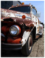
| 05/08/2006 06:06:22 PM |
Characterby AeroglyphicsComment: This image has an excellent point of view but I agree with a previous commenter - crop more of the image. Often, in pictures, less is more - let the viewer fill in all the other details - we don't need the rest of the truck to know what it is. In this challenge, I gave you a 6 - it was a well taken image. |
 Photographer found comment helpful. Photographer found comment helpful. |
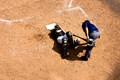
| 05/07/2006 11:11:54 AM |
Hit By Batby Man_Called_HorseComment: my favorite image in the challenge. I think its the POV, combined with all the empty space. contrast is a little high but caused by sunlight, yes? Maybe its cause I'm such a baseball fan... 9 |
| Photographer found comment helpful. |
| 05/07/2006 11:11:47 AM |
|
| Photographer found comment helpful. |
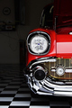
| 05/07/2006 11:11:42 AM |
57by RKTComment: beautiful rendition. Can still see the washer in the background, but that can be fixed with further editing. The sharpness, detail, and color draw my attention away enough that I don't see it. Well kinda. :) 9 |
| Photographer found comment helpful. |
| 05/07/2006 11:11:34 AM |
Sexyby LalliSigComment: beautiful toning and lighting. helps to have a beautiful model. :) 9 Bump to 10. Should ribbon. |
| Photographer found comment helpful. |
| 05/07/2006 11:11:13 AM |
Follow the Leader by DrAchooComment: graphically the strongest image of the challenge. Sharp, clean, colorful. Should place well. 9 Bump to 10. The probable winner. And deservedly so. |
| Photographer found comment helpful. |
| 05/07/2006 08:03:19 AM |
Tulipby MstarkeyComment: The lighting works well on this but I feel the depth of field is too short. |
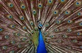
| 05/07/2006 08:01:29 AM |
Peacockby phreakonComment: This image is very well taken - the bird is sharp, DOF is good, colors well done. I think where this could be improved is in the crop. The bird is facing towards the right so if you cut the left third of the image, it would put the bird looking across the image. This would make the image more dynamic. We all know of a peacocks huge array of feather so, even without it in the image, our minds fill it in. Doing this would bring the bird closer to the viewer for a more intimate shot. Also, as it is, we cannot see his eye or what he might be looking at. Very slightly lightening the eye or the space around it would make the eye stand out. I would bet, with those two changes, this image would score a point better with the DPC voters. |
| Photographer found comment helpful. |
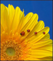
| 05/07/2006 07:52:43 AM |
Home In A Roseby ralfwComment: composition well done. Slight softness of the petals works very well. For me, if the depth of field were a little larger, bringing the spider into better focus, it would be a better image. I know - almost an impossibility in the situation you have here. Maybe if he was a little darker - not sure - but the rose vastly outweighs him visually so he doesn't really hold my attention. |
| Photographer found comment helpful. |
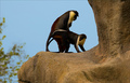
| 05/07/2006 07:47:55 AM |
Monkey Businessby ShutterPugComment: I think this would be a much stronger image if the left third and right third were cropped to make it a vertical image. That would get rid of the tree and most of the rock and focus the viewers attention on the monkeys. Great timing! |
| Photographer found comment helpful. |
Home -
Challenges -
Community -
League -
Photos -
Cameras -
Lenses -
Learn -
Help -
Terms of Use -
Privacy -
Top ^
DPChallenge, and website content and design, Copyright © 2001-2026 Challenging Technologies, LLC.
All digital photo copyrights belong to the photographers and may not be used without permission.
Current Server Time: 07/27/2026 05:42:47 PM EDT.