|
|
|
Showing 1181 - 1190 of ~3496 |
| Image |
Comment |
| 10/26/2006 06:35:26 AM | Untitledby TejComment: As far as bokeh is concerned, this image has it and it works to enhance the subject. I think the composition is a little lacking though as the image as a whole feels off balance - its almost two images in one frame. Your DOF is excellent and I like the detail in the subject. 6 - may bump after viewing rest. Good luck in the challenge! |  Photographer found comment helpful. Photographer found comment helpful. |
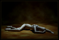
| 10/25/2006 08:28:04 AM | Bourgeoisby MardukulComment: I loved this and I can't understand its score. Maybe the more sensitive users didn't like the naked man. Their loss. Fascinating capture and I like that you left the color in. His looking at the camera makes me feel like an intruder of sorts - must be the extression. A camera can be an intruder - I know when its aimed at me I feel naked... |
| 10/25/2006 06:39:59 AM | scratchin & pickinby SkipComment: skip, you should know by now - its not great technique that scores well here - its drama, preferably in a landscape or seascape or beautiful person. I'll bet most people looked at this and said, "Where's the lighting?" Duh. And I'll bet not one even knew you used a flash. You're a great photographer and you know it. Who cares what the masses think in a narrowly defined catagory. Its a great shot. Smile and know you pulled one over on them. :) | | Photographer found comment helpful. |
| 10/24/2006 09:22:46 PM | despair by tcmartinComment: I just realized I never told you how great this was. I love the back drop - where did you get it? Excellent lighting - perfect to set the mood. Congrats on your blue!! | | Photographer found comment helpful. |
| 10/24/2006 08:44:58 PM | Ducky Balloonby klie0500Comment: Greetings from the Critique Club!
First off, as far as images go, this is well taken. The subject is sharp, it is composed well, the background has some interest. I think, with just a touch more processing, this image would pop. Right now it almost looks like an untouched RAW file. If the image were mine, I would do a curves adjustment, a slight saturation boost, and then a levels adjustment (I posted a quick edit here: //www.dpchallenge.com/image.php?IMAGE_ID=416826).
As far as images go, as I said before, this is well taken. However, for me at least, it holds very little interest. This is more of a documentary shot - showing me something that exists. It doesn't evoke emotion so it holds my interest for a short time. That is not bad in photography; documentary photography is required (I shoot for a paper so I do it all the time). But, The shots that people like to look at tell a story at the same time. The action here, in the basket, is to small to discern. And since all I see is the balloon, I have no context. So you are caught - not close enough to give me some action and not far enough away to give me context. I need one or the other to connect with the image.
I hope that this critique answers some questions you may have. If not, feel free to PM me and I will better explain any questions you have. | | Photographer found comment helpful. |
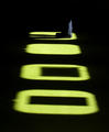
| 10/22/2006 10:47:10 AM | In The Limelightby ArtanComment: Greeting from the Critique Club!
Artan! Long time no see!
Excellent image here. 'Fraid a lot of people thought it didn't fit the challenge. Their loss. The only change I would make to this image is a curves adjustment to get the bottom to black. It just screams at me that it wants to be black. Other than that, I love the minimalism, the DOF and sharpness of the subject, the use of unusual light. Extremely well done and I am thouroughly intrigued by the boxes. Maybe in a shadow challenge this would have score a point higher.
I think, for me at least, you accomplished your goal - I know the subject is there and I want to get to know it better. I completely believe that less is more. You have given me enough to pique my interest. Sorry for the short critique but there's nothing to critique. Except for the voter's thoughts. But I could spend an hour on that. :) Looking forward to more of your images! | | Photographer found comment helpful. |
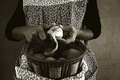
| 10/22/2006 10:04:59 AM | Housewifeby Rino63Comment: Greeting from the Critique Club!
What a wonderful image! I think this has great bones and I think it fit perfectly with the challenge topic. The duotone works very well here - gives the image a sense of timelessness. I think the lighting works very well to enhance the image and the focus is dead on.
But (there's always a but, right?) I think there are a couple of things working against this image that could be easily fixed in post processing (I work with the image I have) and may have gotten you a slightly higher score (if that matters to you). The background, while interesting, detracts from the overall feel of the image. You could easily blur it into a mottled background which would work very well with the feel of the image. The crop is unbalanced. This often works but for this image I feel it distracts. There is no purpose in the lack of balance and it does nothing for the image. I tried a square crop as suggested by a commentor but that didn't work for me - it left her no elbow room. The midtones are just a tad muddy. A very, very slight curve only at the mid point might make a difference.
Anyway, I love this image - simple truth. This is the way it is. Wonderful that way. You've done an excellent job portraying a housewife in an artistic, thoughful manner. The focus is great and the lighting well done. | | Photographer found comment helpful. |
| 10/22/2006 08:25:41 AM | Shhh!!! The Scarecrow is Sleeping!by lauraodomComment: Greetings from the Critique Club!
This image shows you have a good mastery of the technicals. The lighting works, the image is focused well for the subject (including DOF), there seems to be no WB issue.
However, I find the crop awkward. There is space on two sides and no space on two sides. This wouldn't necessarily be an issue except for the angle the image was shot at. The subject seems to be sliding out of the frame, making it uncomfortable for me (the viewer). I feel like trying to grab the subject and pull her back up into the image. The foot is cut off which wouldn't be a problem if it was balanced somehow by the other side of the image. But it isn't. This image screams (to me) for an either looser or tighter crop. Something to pull it in balance and keep the subject from sliding out of the frame.
At any rate, you scored well on cuteness factor (picking a good subject is half the battle) and you have three favorites. Quite an accomplishment at DPC for an image of a child. I think you chose the right color background also. White or black would have been way too harsh for the subject. | | Photographer found comment helpful. |
| 10/22/2006 08:13:01 AM | Le Criby lowonenergyComment: Greetings from the Critique Club!
Let me first state that I like this image and gave it a 7 during voting. With a little more processing, it would have been higher. I think the composition works with the subject. The awkward crop through the middle of the face works with the overall feel of the image. I get a sense of frenzy. Now, you have a great base image to work with but I think you stopped short in your processing. To work with the image, a slight amount of USM and a bit more of a curve would really make this image pop. Currently, its a little flat for the subject. For me it just doesn't work. The curve boost would also add saturation to the colors in the image, throwing it even more towards meeting what I think is its goal. (see my 30 second edit here: //www.dpchallenge.com/image.php?IMAGE_ID=415051)
An image works best when all of its elements reinforce its intended message. Anyway, I really liked this image during the challenge. It was creative, well planned, and well executed. The lighting and composition are great as is the use of the background. I think you only got caught in the 5's because of the lack of strong post processing to reinforce the message of the image.
| | Photographer found comment helpful. |
| 10/22/2006 07:56:36 AM | essence of my lifeby gocComment: Greetings from the Critique Club!
An image like this could go 100 different ways. You could have 100 different critiques from 100 different people. None of it matters - you like the image. Does this 'portrait' give me a sense of the boy in the image? Yes, I think so. Are there things I would change on a re-shoot? Yes. Are there things I would edit differently if this was the shot I had? The only thing I can think of would be to loosen the crop a little, if that's possible. The image feels confining in an uncomfortable way, like the boy's world is so limited...
If I had a reshoot? I would lower my camera angle so I'm not looking down on him. It would open up his world - children need a large world. I would ask the person on the right to move so the boy is not in shadow - children need light to grow.
I guess what I am saying is this feels more like a portrait of the photographer - even the title states that this is your world. Not his. For a protrait, I want to see his world and his place in it - I would hope it would be wide open and large. I hope that makes sense. The image itself is fine - in focus, good toning for the lighting available, composed comfortably; but for me, it doesn't move beyond a candid - the capture of a moment in time. I need more to want to look over and over again. | | Photographer found comment helpful. |
|
Showing 1181 - 1190 of ~3496 |
Home -
Challenges -
Community -
League -
Photos -
Cameras -
Lenses -
Learn -
Help -
Terms of Use -
Privacy -
Top ^
DPChallenge, and website content and design, Copyright © 2001-2026 Challenging Technologies, LLC.
All digital photo copyrights belong to the photographers and may not be used without permission.
Current Server Time: 07/24/2026 09:12:14 PM EDT.
|