| Image |
Comment |
| 10/06/2006 10:12:01 PM |
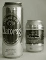
Who´s the bigger?by CimanComment: I like the duatone. The text could be a bright bold color and font to really grab the viewers attention. Comp works really well for the creative placement of test and the product is very well displayed. |
| 10/06/2006 09:06:34 PM |
bottoms up!by crayonComment: Classic job and original thinking. Condensation is a nice touch. Catch line is excellent. Comp is perfect for text placement. Very, very nice. |
 Photographer found comment helpful. Photographer found comment helpful. |
| 10/06/2006 09:03:14 PM |
Good to the Last Dropby mfimanComment: Replace this with a coffe cup and I think Maxwell House Coffee would be calling you. Lighting is a bit inconsistant and photo overall needs to be sharper. Nice comp. |
| 10/06/2006 09:01:43 PM |
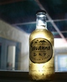
Yogurt mix strawberryby sorayaComment: I like the comp and lighting. Text would fit well in this. Umbrellas add a tropical feel but....The beverage doesn't look appetizing. Perhaps you could've blended it bit more. Great start. |
| 10/06/2006 08:59:03 PM |
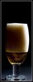
Beerby JimmieComment: I like the idea, concept and the way the dof isolates what you're selling. The bottle for some reason, doesn't look frosty. This is one of the photos that really doesn't need text to be an ad. Very nice. |
| 10/06/2006 08:49:09 PM |
Beerby srdanzComment: Lighitng is interesting but I wonder if it highlights the product enough. I'd definitely use a beer with less foam. Background color would work well with text. |
| Photographer found comment helpful. |
| 10/06/2006 08:47:23 PM |
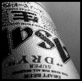
Coorsby -kipComment: Nice lighting and you're on the right track as far comp goes. The comp here lends itself well to creative text placement. I'd use either a tighter or wider crop. One that would show the whole bottle or one that focuses more on the label. I like the bronze shadow.8 |
| Photographer found comment helpful. |
| 10/06/2006 08:41:33 PM |
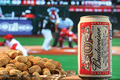
Game Timeby GoboltsComment: Excellent ad! Nice DOF and great presentation of product. Nice attention to detail with the condensation on the can. |
| 10/06/2006 08:24:40 PM |
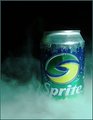
Cool night drinkby craigesterComment: This id one of the set up photos that doesn't really need text to be a great ad. I'm sure of whats being sold and it's very well displayed. Only distraction is the bottle should really be alot sharper so it stands out more. |
| Photographer found comment helpful. |
| 10/06/2006 08:22:24 PM |
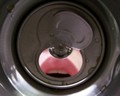
That misty freshnessby Trumpeteer4Comment: Cool effects. I'd like to see a levels adjustment to give it more "pop". Comp is perfect and displays product well. Very nice concept and overall presentation. |
| Photographer found comment helpful. |
Home -
Challenges -
Community -
League -
Photos -
Cameras -
Lenses -
Learn -
Help -
Terms of Use -
Privacy -
Top ^
DPChallenge, and website content and design, Copyright © 2001-2026 Challenging Technologies, LLC.
All digital photo copyrights belong to the photographers and may not be used without permission.
Current Server Time: 07/21/2026 07:36:57 AM EDT.