| Image |
Comment |
| 02/06/2008 09:27:09 PM |
|
 Photographer found comment helpful. Photographer found comment helpful. |
| 02/06/2008 09:25:42 PM |
|
| 02/06/2008 09:24:39 PM |
Want Your Mouth To Feel Like An Icy Cave?by libertyComment: I like the feel this ad has. I can really feel the cool "icyness" of this. The product is very well displayed. I think you could've gotten away with a tighter crop. to really snap the product out. Nice work. |
| Photographer found comment helpful. |
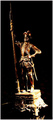
| 02/06/2008 09:18:11 PM |
Lone Antic Knightby rezaira2002Comment: Unless this ad is for e-bay, I'm not sure what the product is. Comp would work well with text. But needs a tighter crop for online sales. |
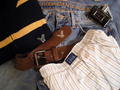
| 02/06/2008 08:25:40 PM |
Subtle Advertisementby cyclingtmbComment: Nice start. I'm sure its clothes that you're selling. Focus needs to be sharper and less items would make this more effective. |
| 02/06/2008 08:14:56 PM |
Orange Trio - $19.99by TuckersmomComment: Very effective. I like ads like this. Less is more. Your title fits this concept too. A little negative space to the top or bottom (or side) would allow text to flow easier into the ad. |
| Photographer found comment helpful. |
| 02/06/2008 08:11:56 PM |
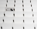
moo.com - walking out of the sea of bland business cardsby hopperComment: There are so many possibilities for this but as it sits, I'd never guess the product without the title. However, My creative team would have a blast adding text and photos to the blank cards to create something very special. You're definitely on the right track here. Good work. |
| Photographer found comment helpful. |
| 02/06/2008 08:09:10 PM |
Sportscraft, Est. 1926by trnqltyComment: Nice POV and exposure. I'm not sure what the product is but a tighter crop that displays the trademark plaque better would resolve this. I.E. Wider angle closer. |
| Photographer found comment helpful. |
| 02/06/2008 08:06:50 PM |
|
| Photographer found comment helpful. |
| 02/06/2008 08:05:25 PM |
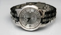
Tissot. Keeping time since 1853by hsvhoonComment: Perfect photo for an ad. Crisp with enough contrast. Product is prominantly displayed. A less centered comp would let text flow better bu t overall an outstanding entry. |
| Photographer found comment helpful. |
Home -
Challenges -
Community -
League -
Photos -
Cameras -
Lenses -
Learn -
Help -
Terms of Use -
Privacy -
Top ^
DPChallenge, and website content and design, Copyright © 2001-2026 Challenging Technologies, LLC.
All digital photo copyrights belong to the photographers and may not be used without permission.
Current Server Time: 07/18/2026 04:21:37 PM EDT.