| Author | Thread |
Comments Made During the Challenge  |
|
|
02/12/2008 03:49:17 PM |
|
 Photographer found comment helpful. Photographer found comment helpful. |
|
|
02/11/2008 10:25:01 AM |
|
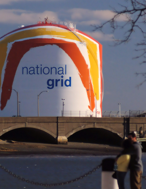
The strongest part of your image is the background it adds emphasis on the subject. |
|
| Photographer found comment helpful. |
|
|
02/11/2008 10:10:21 AM |
|
The people in the right corner of the picture are blurry, which take away from the whole shot. By using a new angle the picture could have been more interseting. |
|
| Photographer found comment helpful. |
|
|
02/11/2008 09:45:34 AM |
|
It definitely conveys them message but it's not a very creative shot. |
|
| Photographer found comment helpful. |
|
|
02/11/2008 03:03:53 AM |
|
| Photographer found comment helpful. |
|
|
02/10/2008 10:04:50 AM |
|
Good idea. Maybe a lower angle and make the people larger in the foreground. |
|
| Photographer found comment helpful. |
|
|
02/10/2008 01:28:55 AM |
|
Cute idea but I think the DOF should have been greater so the couple is more in focus. My inital thought when looking at this was "why are the people out of focus, they should be cropped out". Then I read the title and got it. |
|
| Photographer found comment helpful. |
|
|
02/07/2008 04:21:45 PM |
|
the blur on the foreground and tree is a bit distracting. Perhaps a composition where it was not included would be better |
|
| Photographer found comment helpful. |
|
|
02/07/2008 02:09:00 PM |
|
The people blurred out in the corner really bug me. Also, it seems taht your blues are jst really grey except for on the text. Subject has potential, but other angles would probably benefit it MUCH more |
|
| Photographer found comment helpful. |
|
|
02/07/2008 08:19:09 AM |
|
Had to think about it. And that often means a low score from speed voters who do not take the time to think. 6 |
|
| Photographer found comment helpful. |
|
|
02/06/2008 09:27:09 PM |
|
Funny, but most wouldn't get it. I like the concept but think a tighter shot of the couple with a wider angle would've gotten the effect I think you're trying for. |
|
| Photographer found comment helpful. |
|
|
02/06/2008 09:28:56 AM |
|
I think you could have grasped the concept a little more thoroughly. |
|
| Photographer found comment helpful. |
Home -
Challenges -
Community -
League -
Photos -
Cameras -
Lenses -
Learn -
Help -
Terms of Use -
Privacy -
Top ^
DPChallenge, and website content and design, Copyright © 2001-2026 Challenging Technologies, LLC.
All digital photo copyrights belong to the photographers and may not be used without permission.
Current Server Time: 06/21/2026 03:15:24 AM EDT.