| Image |
Comment |
| 02/07/2008 08:22:56 PM |
|
 Photographer found comment helpful. Photographer found comment helpful. |
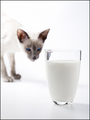
| 02/07/2008 08:21:37 PM |
Milk. There's nothing like it.by h2Comment: Product is displayed prominantly and attractively. (that's a good looking glass of milk!) cat adds some ambience and the comp lends itself well for text placement. Nice job. |
| Photographer found comment helpful. |
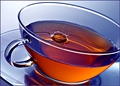
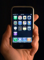
| 02/07/2008 08:20:03 PM |
Trojanby BujanxComment: heh heh heh.... great idea and I know from experience that it still sells. However the light seems a bit dark and the ad needs more of an emphasis on the product to sell it better. |
| Photographer found comment helpful. |
| 02/07/2008 08:18:18 PM |
|
| Photographer found comment helpful. |
| 02/07/2008 08:16:47 PM |
|
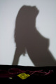
| 02/07/2008 08:14:55 PM |
Touching is Believingby arron_christensenComment: Nice idea and concept. COmp could use a bit more negative space to place eventual text and the focus could be bit sharper but you're on the right track. |
| Photographer found comment helpful. |
| 02/07/2008 08:14:50 PM |
|
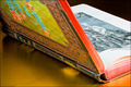
| 02/07/2008 08:10:25 PM |
Rare Books - not your average paperbackby HeiSchComment: I wonder if the product is properly displayed or if the message "they don't make em like they used to" is what you're trying to sell. A wider crop would display your product better butthe other technicals seem fine. |
| Photographer found comment helpful. |
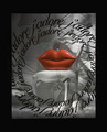
| 02/07/2008 02:50:48 PM |
Love Is...by chris_hertfordComment: Love is....A big set of lips waiting on the chair? too funny. Professionally I'm having problems seeing whats for sale. The text is a bit distracting but does lead the viewer towards the subject. If what's being sold here is the jewelery, more emphasis should be placed on the product so the potential client will get the message. I like the texture on the backdrop and the technicals are right on. |
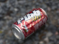
| 02/07/2008 02:45:09 PM |
Mr. Pibbyby justin27Comment: Product is prominant but need to be more in focus. A less centered commp would work better with text. Nice start. |
Home -
Challenges -
Community -
League -
Photos -
Cameras -
Lenses -
Learn -
Help -
Terms of Use -
Privacy -
Top ^
DPChallenge, and website content and design, Copyright © 2001-2026 Challenging Technologies, LLC.
All digital photo copyrights belong to the photographers and may not be used without permission.
Current Server Time: 07/19/2026 01:27:41 AM EDT.