| Image |
Comment |
| 02/10/2008 04:46:46 PM |
The gourmet mealby mabesComment: Food shots are hard. The DOF has to right on or it doesn't seem appitizing. I should be able to recognize what it is that being sold and I can't here. sorry. |
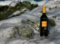
| 02/10/2008 04:44:48 PM |
Rock Winesby KarenNfldComment: Nice product display. comp would work for text and the ice gives it a "cold" feel.I would've brought the bottle closer to hightlight it more. |
 Photographer found comment helpful. Photographer found comment helpful. |
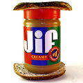
| 02/10/2008 04:42:51 PM |
Best Friendsby EssAreDubyaComment: Not bad. Comp is workable and product is clearly displayed. A little more light on the camera would help make more of an impact. |
| Photographer found comment helpful. |
| 02/10/2008 01:27:53 PM |
|
| Photographer found comment helpful. |
| 02/10/2008 01:19:20 PM |
Eye Candy for Photographersby cislanderComment: I can picture this in a Ritz Camera shop poster for a Valentine's day sale. A bit more space on top would let the creative team place text easier. A bit more contrast and selective color saturation boost would give a bit richer color to the candy. One of the better ads in the theme for its potential. |
| Photographer found comment helpful. |
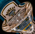
| 02/10/2008 01:15:29 PM |
Sapphire Dreamsby Dr.ConfuserComment: Nice work here. I like the tilt and that the product is prominant.A little more negative space on the left or right would help place text. |
| Photographer found comment helpful. |
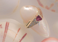
| 02/10/2008 11:16:43 AM |
Pretty in pink-J Ritz designer of fine jewelryby jimntonicComment: Not bad. The tones are great for the product and there's plenty of negative space for text. However, I don't feel that the ring is the most prominant element in the ad. Perhaps more contrast and a different POV would aliviate this. |
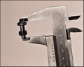
| 02/09/2008 09:17:04 PM |
Acme Precision High Quality Fasteners Since 1928by GreetmirComment: I like this and not too many have tried this association type of add. By putting the Micrometer you give the feeling of "Precise". Very nice. Product is well displayed and tones add to the feel of thead. Negative space makes text placement easy. I mat of gone wuth a tighter crop and less tilt but yours is very, very nice. |
| Photographer found comment helpful. |
| 02/09/2008 09:07:36 PM |
|
| Photographer found comment helpful. |
| 02/09/2008 09:05:55 PM |
Naturally.by stickmanmitchComment: I like this. Its message is very in your face as ads should be. Its clear what the product is. A little less centered comp would help balance this out when text is added. Overall, very effective ad. |
Home -
Challenges -
Community -
League -
Photos -
Cameras -
Lenses -
Learn -
Help -
Terms of Use -
Privacy -
Top ^
DPChallenge, and website content and design, Copyright © 2001-2026 Challenging Technologies, LLC.
All digital photo copyrights belong to the photographers and may not be used without permission.
Current Server Time: 07/18/2026 11:38:41 AM EDT.