| Author | Thread |
Comments Made During the Challenge  |
|
|
02/12/2008 07:37:29 PM |
|
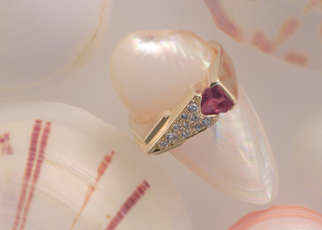
Good and well composed, but not quite enough punch in the colors to stand out. |
|
|
|
02/11/2008 10:16:14 PM |
|
The subject seems to fade into the background to me. I might try a more contrasting background. |
|
|
|
02/11/2008 12:11:14 PM |
|
Colors of the photograph blend very nicely together. The shell with the ring on it appears to come out of the picture and draws the eyes immedeantly. |
|
|
|
02/11/2008 10:20:53 AM |
|
This photo has no real emphasis, there is too much going on. Maybe a very close up or a different background could help. |
|
|
|
02/11/2008 02:58:03 AM |
|
pretty but rather distracting |
|
|
|
02/10/2008 11:16:43 AM |
|
Not bad. The tones are great for the product and there's plenty of negative space for text. However, I don't feel that the ring is the most prominant element in the ad. Perhaps more contrast and a different POV would aliviate this. |
|
|
|
02/10/2008 01:30:19 AM |
|
The color doesn't work for me, not enough contrast, all of the objects seem to blend in to one another. |
|
|
|
02/08/2008 04:08:22 PM |
|
The ring kind of looks awkword on a shell |
|
|
|
02/06/2008 10:28:54 PM |
|
The jewelry tends to get lost in the background. Needs more contrast to pull it off. |
|
|
|
02/06/2008 02:21:40 PM |
Message edited by author 2008-03-03 18:39:18. |
|
Home -
Challenges -
Community -
League -
Photos -
Cameras -
Lenses -
Learn -
Help -
Terms of Use -
Privacy -
Top ^
DPChallenge, and website content and design, Copyright © 2001-2026 Challenging Technologies, LLC.
All digital photo copyrights belong to the photographers and may not be used without permission.
Current Server Time: 06/29/2026 05:37:02 AM EDT.