| Image |
Comment |
| 12/18/2006 03:50:21 AM |
Selling Fast!by alifeinexileComment: Very, very nice! I don't know how to improve on this! I could see this in an ad with the bottom corners extended by cloning and the top accented with a curved graphic (just belos the sprinklers)! 10 |
 Photographer found comment helpful. Photographer found comment helpful. |
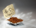
| 12/18/2006 03:44:55 AM |
Priced to Moveby karmatComment: You're like me. Combining challenges. :) Funky BG, I wonder if it's just reflections or creative dodging. Neat. |
| Photographer found comment helpful. |
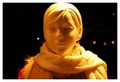
| 12/18/2006 03:41:43 AM |
Nobody told me ... I was soldby names_amitComment: Blown highlights, but thats not too big of a deal. The BG light on the left is really distracting though. It emphasizes the very warm tone. I would either adjust the white balance a bit or desaturate reds a bit or tint the light on the left to match. Nice concept. |
| Photographer found comment helpful. |
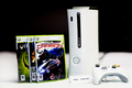
| 12/18/2006 03:37:40 AM |
The Xbox 360by terjeComment: Just a couple of suggestions:
Crop just a bit tighter, lose the cord(?) in the BG, a slightly lower camera angle would strenghten your subject, and ease off the contrast just a little.
That said this is a nice shot. BTW, I'm jealous. :) |
| Photographer found comment helpful. |
| 12/18/2006 03:32:13 AM |
|
| Photographer found comment helpful. |
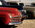
| 12/18/2006 03:20:52 AM |
Big Al's Used Carsby Postgate1Comment: I like the colors and wide DoF. The trouble is finding a clear subject. The bright red car competes in form with the rest of the image. An even lower camera angle might get rid of those power lines too. |
| Photographer found comment helpful. |
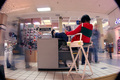
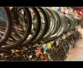
| 12/18/2006 03:16:51 AM |
Bike Shopby smurfguyComment: That’s a lot of border! I see what you were going for though. Nice concept, but the focus is too much in the foreground IMO. This creates a large amount of "busy, negative space". If the focus was a little deeper in the shot it may be more balanced. |
| Photographer found comment helpful. |
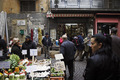
| 12/18/2006 03:13:13 AM |
Mercatino rionaleby Rino63Comment: I like this shot. There is a sense of frenzied motion that is very appealing. I am bothered a bit by what looks like slight barrel distortion which, combined with this crop/composition, draws my eye up to the window on the left. |
| Photographer found comment helpful. |
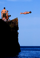
| 08/11/2006 04:14:16 PM |
First In Flightby alfrescoComment: Great colors and timing, but it seems like you're trying to get alot in here. If the cliff is the subject, the vertical composition makes sense, but I would like to see the rock face properly exposed. If the diver is the subject (as I believe he is here) perhaps a horizontal (or square) composition would work better to emphasize the movement and position of the diver. Still, a very nice shot. |
| Photographer found comment helpful. |
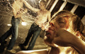
| 08/11/2006 01:08:03 PM |
Fight Clubby steinarComment: Nice shot (if a bit gross). If you were going for the colors of the film, you've just about nailed it. Just try bringing the reds down a bit in the highlights. Good job! |
| Photographer found comment helpful. |
Home -
Challenges -
Community -
League -
Photos -
Cameras -
Lenses -
Learn -
Help -
Terms of Use -
Privacy -
Top ^
DPChallenge, and website content and design, Copyright © 2001-2026 Challenging Technologies, LLC.
All digital photo copyrights belong to the photographers and may not be used without permission.
Current Server Time: 07/16/2026 07:38:57 AM EDT.