| Image |
Comment |
| 02/03/2004 11:47:03 AM |
|
 Photographer found comment helpful. Photographer found comment helpful. |
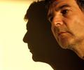
| 02/03/2004 11:46:34 AM |
Spirit of Hamleinby KoriyamaComment: Good idea for the challenge. I think the cloth is causing this to look like noise/grain. I actually like the look and think it adds here. Good work, good luck in the challenge. |
| Photographer found comment helpful. |
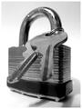
| 02/02/2004 07:24:57 PM |
Lock & Keysby faidoiComment: Hard to be original with this many people. Good entry, good idea, nicely shot. |
| Photographer found comment helpful. |
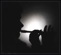
| 02/02/2004 07:15:09 PM |
Glass of Wine and a Fire!by Dim7Comment: I would like to see the glass not centered and more focus, the edges are a wee bit soft. Good luck in the challenge. |
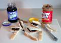
| 02/02/2004 07:14:18 PM |
College Survival Kitby bgartside47Comment: I don't dislike your idea but the composition is a little weak. Things look a bit lined up and un-natural. P.S. Eat your crust!! |
| Photographer found comment helpful. |
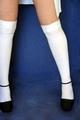
| 02/02/2004 07:13:07 PM |
Stilettos & Stockingsby jenesisComment: I don't dislike your idea but the black shoes are lost on the dark bg. It's a sexy shot and I wish you luck in the challenge. |
| Photographer found comment helpful. |
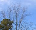
| 02/02/2004 07:12:13 PM |
Birds and treesby neenee1999Comment: I don't dislike your idea but the composition is weak. Maybe this would of had more punch if you had focused on the lower branches by themselves. |
| Photographer found comment helpful. |
| 02/02/2004 07:09:29 PM |
Party At Your Own Riskby kim100878Comment: Foil lables can be hard to shoot without the light bouncing around. Hard to see the pretzels and the shine is messing up the lable. Good colors and good idea for the challenge. |
| Photographer found comment helpful. |
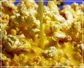
| 02/02/2004 07:08:11 PM |
"Buttered Popcorn"by fredrojComment: Oh man that is a bunch of butter...looking more like soup. Your focus, and light are pretty good. I just can't get beyond all that butter ....sorry. |
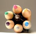
| 02/02/2004 07:07:13 PM |
Pen and Pencilsby NeuferlandComment: The lighting is way too harsh and the shadow is tilted to the right. I think your light washed out the colors leaving this a little flat. I like the idea and composition. Do you shield your lights? Try that with some foil/plastic bag, or a light towel. |
| Photographer found comment helpful. |
Home -
Challenges -
Community -
League -
Photos -
Cameras -
Lenses -
Learn -
Help -
Terms of Use -
Privacy -
Top ^
DPChallenge, and website content and design, Copyright © 2001-2026 Challenging Technologies, LLC.
All digital photo copyrights belong to the photographers and may not be used without permission.
Current Server Time: 05/12/2026 01:29:45 PM EDT.