| Image |
Comment |
| 12/08/2008 05:26:14 AM |
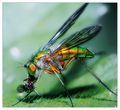
Rozby GregoryBComment: This image is like "far out" man... trippin' even. Love the colours. |
 Photographer found comment helpful. Photographer found comment helpful. |
| 12/08/2008 12:10:05 AM |
a dangerous world by rozComment: Way to go Roz. This is an absolutely BRILLIANT image. Absolutely. Well done, and congratulations... on the ribbon, but more so for the PB. |
| Photographer found comment helpful. |
| 12/07/2008 06:36:41 PM |
Feast for ONE by hotpastaComment: Way to go Enzo. Congratulations on the blue ribbon... I was sure that this Speed Challenge would go to someone with a Thanks Giving photo... but alas, I forgot about the calibre of the local (i.e. Australian) talent. Well, done. |
| Photographer found comment helpful. |
| 12/03/2008 06:06:43 PM |
Jupiter and moonsby scooter97Comment: That is so cool. I'll be going to the to the original RAW of my Venus, Jupiter, Moon alignment photo to see if I caught any of the moons of Jupiter.

|
| Photographer found comment helpful. |
| 12/03/2008 06:02:04 PM |
Day-3.jpgby carofoComment: Nice shot. I like the duotone treatment which hides the spaghetti factor. I, like you, thought of submitting my shot (see my Day 1 submission in the Dec Whatever SC, but thought it didn't fit the challenge description. |
| Photographer found comment helpful. |
| 12/03/2008 12:05:32 AM |
|
| Photographer found comment helpful. |
| 12/02/2008 11:52:18 PM |
Whatever 3 by AliciaComment: This has inspired me to investigate overlays... not something I've ever thought of doing, but this image is absolutely fantastic. |
| Photographer found comment helpful. |
| 12/02/2008 08:20:06 PM |
Day-2.jpgby carofoComment: Very nice photo. Would have done well in a challenge, and not only b/c of the water drops. :)
I like the processing too. |
| Photographer found comment helpful. |
| 12/02/2008 04:19:17 PM |
Makin' Magicby BarbBComment: Great image. Well composed and processed. Love the colours. Guess it pays to live in such a beautiful part of the country. |
| Photographer found comment helpful. |
| 12/02/2008 02:00:38 AM |
Day 2by nixterComment: Very Nice Nick. Great use if the texture. |
| Photographer found comment helpful. |
Home -
Challenges -
Community -
League -
Photos -
Cameras -
Lenses -
Learn -
Help -
Terms of Use -
Privacy -
Top ^
DPChallenge, and website content and design, Copyright © 2001-2026 Challenging Technologies, LLC.
All digital photo copyrights belong to the photographers and may not be used without permission.
Current Server Time: 09/17/2026 05:10:26 PM EDT.