| Image |
Comment |
| 11/25/2006 07:47:37 AM |
Welcome to Heron Bayby IndigoButterflyComment: I think this is a lovely image, but the white at the top detracts (for my taste). It's cutting off the tops of the gables and since it's not the same shade of white, it adds some distraction. The text is beautiful as in the general composition, but I would love to see the entire building. |
 Photographer found comment helpful. Photographer found comment helpful. |
| 11/25/2006 07:00:29 AM |
|
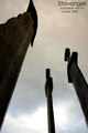
| 11/25/2006 06:59:09 AM |
Greetings from Stavangerby krakurComment: Great postcard. I'm crazy about the angle of view - really unique and very nice. Another thing I appreciate about this is the subtle text. It's perfect for a postcard and gives a little info about Stavanger, too. |
| Photographer found comment helpful. |
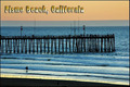
| 11/25/2006 06:57:29 AM |
Pismo Beach, Californiaby DelRioPhotoComment: I like this a lot with the gorgeous pastel colors and the lone surfer. The text is a drawback for me though, because the gradient in the text contradicts or conflicts with the calm feeling given by your photograph. |
| Photographer found comment helpful. |
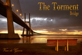
| 11/25/2006 06:54:50 AM |
Vasco da Gama Bridgeby De SousaComment: Wow. This is beautiful in every way. There doesn't seem to be a single aspect out of place. I hope you put this in your portfolio later without the text. If I see it then, I will add it to my favorites. Lovely shot! |
| Photographer found comment helpful. |
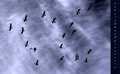
| 11/25/2006 06:52:51 AM |
by undieyatchComment: I'm having a very hard time reading the text on the right and actually have no idea what it says. If I ignore that, I love the birds and sky! There's one bird bottom left that looks almost like an airplane in the background. The texture in the sky is really wonderful. |
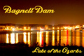
| 11/25/2006 06:50:44 AM |
Night at the Damby bryantbusComment: The text overwhelms the delicate lights and reflections on the water. I'd like to see less grain, too. The positives for me are the colors (love the reds!) and the way the river curves off towards the right. I find the blown parts of the lights to be a bit overwhelming, and wonder how it might be if the entire image were a bit darker. I do like the way the shore frames the bottom of the image. |
| Photographer found comment helpful. |
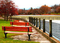
| 11/25/2006 06:47:03 AM |
Peaceful Autumnby gg3rdComment: Gorgeous clarity and fall colors. The composition is classic, with the leading lines and rule of thirds. I like all the lines from the bench, fence, waterfall, each making their own geometry. The only niggle with this for me is the skyline where it meets the trees. Otherwise, very, very nice! |
| Photographer found comment helpful. |
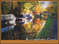
| 11/25/2006 06:44:55 AM |
Basingstoke Canalby dippydazComment: Basingstoke?! I'm going there for work next week - had no idea there were such pretty places to see there. This is therefore a postcard in the best sense. You've shown me something positive about a place in the world that I didn't think had so much to offer other than industry. The colors and the line leading to the canal are very nice. I am a bit distracted by the blown part of the boat to left, but not overly so. I also wish the sidewalk/grass on the right were either lighter or darker to add dynamic feeling, but in basic that would probably be impossible to do without making the rest of the image suffer. The leaves in the water are perfect, just perfect. Nice job! |
| Photographer found comment helpful. |
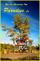
| 11/25/2006 06:41:21 AM |
You Are Ascending Into Paradise, Caby cogeroxComment: I think the yellow is going to hurt you a bit here. Possibly the same setup with border and text would work better with white. Also it appears that the image, at least the sign with all its small signs in the vicinity, is over sharpened. I think the shot meets the challenge quite well, but might get an even better reaction if it were not so centered. This would give it a more dynamic feeling. This is all just my opinion - lord knows, I'm no expert. Hope you don't mind all this input on your image. I think Paradise, Ca looks like a lovely place to visit. |
| Photographer found comment helpful. |
Home -
Challenges -
Community -
League -
Photos -
Cameras -
Lenses -
Learn -
Help -
Terms of Use -
Privacy -
Top ^
DPChallenge, and website content and design, Copyright © 2001-2026 Challenging Technologies, LLC.
All digital photo copyrights belong to the photographers and may not be used without permission.
Current Server Time: 07/18/2026 06:02:54 PM EDT.