| Image |
Comment |
| 11/21/2006 09:55:43 PM |
I ONLY HAVE EYES FOR YOUby krglComment: This just doesn't strike me as a postcard in any way, I'm afraid. I can't say I'm fond of the added texture here, either. Too Photoshoppy for my tastes. |
 Photographer found comment helpful. Photographer found comment helpful. |
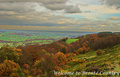
| 11/21/2006 09:54:09 PM |
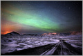
Welcome to Bronte Countryby obsidianComment: Whoa... the colors look really out of whack on this one, I'm afraid. Looks like maybe you had adjusted the shadows and then pumped up the saturation a bit too far. |
| Photographer found comment helpful. |
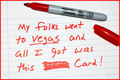
| 11/21/2006 09:51:49 PM |
Vegas Post Cardby RockBruiseComment: Honestly it seems like a bit of a cop-out to me, I'm afraid. As it is, the direct flash kinda blows out the pen, etc. |
| Photographer found comment helpful. |
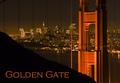
| 11/21/2006 09:50:42 PM |
Golden Gateby bryanbrazilComment: Outstanding! One of my favorites. I really like this angle of the bridge -- super! |
| Photographer found comment helpful. |
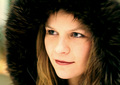
| 11/21/2006 09:49:46 PM |
S I M O N Eby lowonenergyComment: Me thinks I've seen this pretty face before :) Isn't she the same one who we've seen walking toward the camera in a couple ribbon-winning shots in the past? In any case, very nicely done. Meets the challenge well, and she's still very easy on the eyes :) |
| Photographer found comment helpful. |
| 11/21/2006 09:26:51 PM |
|
| Photographer found comment helpful. |
| 11/20/2006 12:36:22 PM |
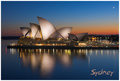
Sydney by FirstyComment: Looks like a winner to me! The exposure is fantastic... beautiful sky, awesome reflection... what more could anyone ask for? :) - 10 |
| Photographer found comment helpful. |
| 11/20/2006 11:01:05 AM |
|
| Photographer found comment helpful. |
| 11/20/2006 10:59:06 AM |
by tateComment: I was there just yesterday, camera in hand, but with the weather being as crappy as it was, I didn't even bother taking a shot! :( I like the angle you shot here -- very nicely done! |
| Photographer found comment helpful. |
| 11/20/2006 10:57:10 AM |
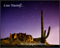
The Superstition Mountains, Arizonaby DrAchooComment: I love the picture... the text could stand out a little better. A drop shadow or stroke might have helped it at the bottom. It gets a little lost in the shot. |
| Photographer found comment helpful. |
Home -
Challenges -
Community -
League -
Photos -
Cameras -
Lenses -
Learn -
Help -
Terms of Use -
Privacy -
Top ^
DPChallenge, and website content and design, Copyright © 2001-2026 Challenging Technologies, LLC.
All digital photo copyrights belong to the photographers and may not be used without permission.
Current Server Time: 07/26/2026 01:51:42 AM EDT.