| Image |
Comment |
| 05/03/2006 11:20:01 PM |
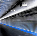
The Blue Lineby Rae-AnnComment: Great job, Rae-Ann, and awesome finish! Perfect crop for this composition and I like the desat - really works well in negative. |
 Photographer found comment helpful. Photographer found comment helpful. |
| 05/03/2006 10:58:40 PM |
Hot and Cool Complementary Peppersby chaliceComment: Trading Post comment
I think you did a good job with the lighting here but it could have had more "pop" (a certifiable DPC term, I'm sure) if the background had been whiter. I suspect you can set this with post processing, though not sure what it would do to the colors of the peppers. My other comment would be that it's a bit busy and haphazard, though I like the sorta diagonal formed by the large red peppers. My grandmother taught my mother who told me that in arranging anything, one should stick to odd numbers - here I think three, or maybe five peppers would be a simpler more dramatic arrangement.
All that said, it scored fairly well, and the folks who gave it 2s and 3s were probably grumpy that day or tired of shots of peppers/vegetables this week. Who knows? |
| Photographer found comment helpful. |
| 05/03/2006 10:11:33 PM |
spookyby DanSigComment: Trading Post comment
I did the "drag, drop, invert" thing for quite a few pics in this challenge - this was one of them. I *really* like the positive version - well lit, well composed, nice detail - all the good stuff. I'm not as fond of the negative. For some reason, negatives of people aren't as appealing as negatives of "things". That said, I think it might be interesting to see in color, reversed, depending on what color you used for a background in this shot.
|
| Photographer found comment helpful. |
| 05/03/2006 10:04:42 PM |
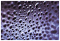
Event Horizonby LouisComment: Trading Post comment
While voting in this challenge, I often took the pic into PS and inverted to see the original. The neat thing about this one is the negative appears to go right to left as far as field of view; the positive is just the opposite (though it you look long enough, they both go both ways).
The reason I didn't score this higher is that it didn't seem "negative" enough to me - in other words, I didn't get the impression I was looking at a "negative", though I knew it was. Technically, you did a very good job with the DOF and exposure. You may try cropping off part of the right side to bring the focused drops just a bit closer to the viewer. |
| Photographer found comment helpful. |
| 05/03/2006 09:56:00 PM |
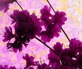
Profiles of Purpleby KelliComment: Trading Post comment
The composition here works for me, even though some may say left to right is more appropriate - I'm kinda fond of right to left. I especially like just the touch of yellow along with the proliferation of purples. I suspect what really hurt your score was the lack of focus on the flowers and the underexposure of the ones closest to the viewer. |
| Photographer found comment helpful. |
| 05/03/2006 09:50:33 PM |
Divisionby nards656Comment: Trading Post comment
Nice score, and an addition to your top row on your profile page, no less! It's bold, bright, simple and has a nice strong diagonal. I don't really notice the blurriness you mention all that much; the texture of the wood is nice against the smoothness of the color and I suppose a bit more sharpening might have helped. I suspect it would have done better had the orange been more "orange" - it looks a little reddish on my monitor. |
| Photographer found comment helpful. |
| 05/03/2006 09:43:04 PM |
...rorrim ,rorriMby timfythetooComment: Trading Post comment
I don't get why folks couldn't figure out how this was done without requesting validation, but take comfort in the knowledge it wasn't just yours - seems everyone who did something like this had "validated" on their entry. Extra point for the clever title and overall creativity.
I did the "invert" thing on this during the challenge voting and would have preferred it in more natural tones. I realize you probably did the saturation thing to give it more "spark", though. I suspect a less cluttered background might have helped a bit too. Overall, I like the concept behind the picture, and you pulled it off pretty well. |
| Photographer found comment helpful. |
| 05/03/2006 09:25:36 PM |
Naturallly Complementedby ericwooComment: Trading Post comment
Good score on this one. My favorite thing about the picture is the composition - I really like the diagonal formed and the shape of the flowers. The colors are good - rich and bright - but maybe a bit too saturated. The blown bits take away from the overall impression, though. I also like the perspective you chose, looking up a bit, but wish the "open" space on the right was smaller or not as bright. |
| Photographer found comment helpful. |
| 05/03/2006 12:11:18 AM |
|
| Photographer found comment helpful. |
| 05/02/2006 08:34:54 PM |
|
| Photographer found comment helpful. |
Home -
Challenges -
Community -
League -
Photos -
Cameras -
Lenses -
Learn -
Help -
Terms of Use -
Privacy -
Top ^
DPChallenge, and website content and design, Copyright © 2001-2026 Challenging Technologies, LLC.
All digital photo copyrights belong to the photographers and may not be used without permission.
Current Server Time: 07/21/2026 03:50:26 PM EDT.