| Image |
Comment |
| 05/11/2006 07:03:06 AM |
LK_0238.jpgby eschelarComment: The focus is good enough here, in my opinion. A little soft, but it works nicely. Great cropping/framing on this one. |
 Photographer found comment helpful. Photographer found comment helpful. |
| 05/11/2006 07:01:15 AM |
LK_0198.jpgby eschelarComment: I like the crop and the angle, but not so fond of the green cast. Really like the way she has just one pigtail showing. |
| Photographer found comment helpful. |
| 05/11/2006 07:00:08 AM |
LK_0239.jpgby eschelarComment: The expressions make this picture - I quite like it. Can't see the place where you cloned the other child at all. You do need to fix a very small bright/white spont on the lip of the child closest to the camera. Their parents would love this! |
| Photographer found comment helpful. |
| 05/10/2006 10:52:27 PM |
Twoby mkComment: As a monochromatic kind of person, I think this is quite nice. It's also kinda dark, which I like too. Very nice work. |
| Photographer found comment helpful. |
| 05/10/2006 09:26:08 PM |
Every Day Rhythmsby tngrndreamComment: Trading Post comment
I liked this as a choice for the challenge, particularly given the title. I may have preferred less of a direct angle, though that may not have created the pattern as well. I do think a more colorful background would have brought out the subject better, and maybe red berries in the bowl - though that may be too much. Lighting looks pretty good to me. Focus is a bit soft but may just need a touch more unsharp mask to correct. By the way, it's pretty striking if you desaturate it to black and white. |
| Photographer found comment helpful. |
| 05/10/2006 09:20:52 PM |
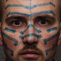
'Til I'm Blue in the Faceby nards656Comment: Trading Post comment
I didn't vote in this challenge, but when I scrolled through, this one made me laugh. Great idea! Need a bit more light to define the eyes and it would have been more effective with more blue. :-) Good job with the skin tones, and I like the crop! |
| Photographer found comment helpful. |
| 05/10/2006 09:16:37 PM |
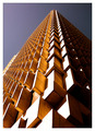
Up, up and awayby ericwooComment: Trading Post comment
Awesome, Eric! This one grabbed me right away, but I don't always comment during voting on those I figure are going to finish well - I figure they get enough comments. Great lines and good balance of the sunlit side to the dark side. Very well seen and well executed. Congrats!! |
| Photographer found comment helpful. |
| 05/10/2006 09:12:35 PM |
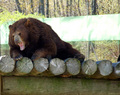
Let sleeping bears lie...or else!by KelliComment: Trading Post comment
Heh! You seem to do really well with the humorous pictures! Great shot to go with the caption/title. Biggest problem is the fence top behind the bear which is blown and pulls the eye away from the bear. A tighter crop keeping the log just beyond his foot "whole" would compensate a bit. The expression you captured is priceless! |
| Photographer found comment helpful. |
| 05/10/2006 09:07:11 PM |
Silk Flower Rhythmby chaliceComment: Trading Post comment
I gave this a 6 in voting. What made it work well for me is not just the rhythm/repetition of the flower, but the curve of the mirror and the lines/curves of whatever is behind it. Balance and composition of the picture are very good.
I'm a kind of monochromatic person so the blue/green in the reflection didn't suit me at first, but in looking at it again, it adds depth to the reflection. Should you want to remove it, you can by adjusting the color balance, increasing red, magenta and yellow (ie effectively decreasing blue, green, and cyan.) |
| Photographer found comment helpful. |
| 05/10/2006 08:31:07 PM |
Thud! Thud! Thwack!by Pug-HComment: Very sharp and crisp. At first I wasn't sure I liked the break in the upper canvas but I think it adds an interesting element. I might have cropped the first two targets out and had just the six, with the swoosh of canvas. Challenge is well-met with this picture. |
| Photographer found comment helpful. |
Home -
Challenges -
Community -
League -
Photos -
Cameras -
Lenses -
Learn -
Help -
Terms of Use -
Privacy -
Top ^
DPChallenge, and website content and design, Copyright © 2001-2026 Challenging Technologies, LLC.
All digital photo copyrights belong to the photographers and may not be used without permission.
Current Server Time: 07/22/2026 02:14:45 PM EDT.