| Image |
Comment |
| 05/17/2006 08:02:00 PM |
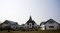
St. Joseph'sby DanSigComment: Trading Post comment
I gave this one a 5. I think it would be much more dramatic in black and white due to the limited color naturally available. I do rather like the centered composition as it suits this structure well. Though it makes for unusual proportions, I think it looks better if the sky is cropped significantly. |
 Photographer found comment helpful. Photographer found comment helpful. |
| 05/17/2006 07:45:18 PM |
Night Light for the Wearyby chaliceComment: Trading Post comment
First - congrats on a new personal best score!! This is a good night shot that tells a story. I like the inclusion of the dark space in front balanced by the tree leaves along the top. The only distraction is the shadow or dark section running up the wall from the bench - not sure if it IS a shadow or where the wall has been stained. Still, the overall impact of this shot is very good. Well seen, well executed. |
| Photographer found comment helpful. |
| 05/17/2006 07:41:03 PM |
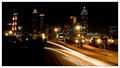
Twinkle, Twinkleby ericwooComment: Trading Post comment
I gave this an 8, Eric. I really like night shots like this and will eventually get some of my own. The vantage point you chose is perfect for this kind of shot - nice balance in the buildings on the skyline, both in height and lighting. I like the way the road curves and disappears into the trees. Color and sharpness are good as well.
(Interesting reading comments after I've written mine. I actually like the dark section in the lower left quite a bit.) |
| Photographer found comment helpful. |
| 05/17/2006 07:25:51 PM |
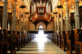
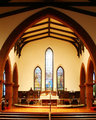
Door to Heaven.jpgby DrAchooComment: Beautiful capture of the light. Did you take a shot vertically? I'd like to see the rest of the pipes. |
| Photographer found comment helpful. |
| 05/17/2006 07:23:33 PM |
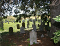
Holy-Places-046.jpgby ragamuffingirlComment: I think the idea you have here is very good, but I'd have not put the front headstone quite so close to center. Maybe take the shot a bit lower to the ground, with the headstone a bit more to the right, and cut out the pine branches on the right. |
| 05/17/2006 07:22:26 PM |
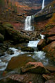
Holy-Places-110_filteredm.jpgby ragamuffingirlComment: Very nice! May be just a touch overexposed - or more likely it was properly exposed but may be better served by underexposing just a bit. Would have done just fine in the challenge. |
| 05/17/2006 07:20:59 PM |
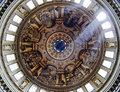
dome-web-usm-small-10556.jpgby obsidianComment: I think the strong light through the windows on the upper right really does add a great deal to this picture. It gives it more "life" than a shot with perfect, symmetrical lighting. And by the way, I think you really ought to get that new camera you were looking at. :-) |
| Photographer found comment helpful. |
| 05/17/2006 06:58:24 PM |
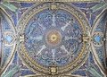
FishMosiacv2.jpgby obsidianComment: This is beautifully composed, Carl - excellent symmetry and the intricate design is presented well. This must have been a sight to behold in person! And this would have done quite well in the challenge, though I completely understand why you didn't enter. Thanks for sharing! |
| Photographer found comment helpful. |
| 05/17/2006 12:28:54 AM |
A Place in the Heartby scalvertComment: Met the challenge as far as I was concerned and was my top pick. Absolutely gorgeous portrait - I'm betting your friend is thrilled with it, too. |
| Photographer found comment helpful. |
| 05/16/2006 11:52:06 PM |
|
| Photographer found comment helpful. |
Home -
Challenges -
Community -
League -
Photos -
Cameras -
Lenses -
Learn -
Help -
Terms of Use -
Privacy -
Top ^
DPChallenge, and website content and design, Copyright © 2001-2026 Challenging Technologies, LLC.
All digital photo copyrights belong to the photographers and may not be used without permission.
Current Server Time: 07/22/2026 11:41:58 AM EDT.