| Image |
Comment |
| 06/14/2006 09:34:31 AM |
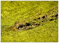
Don't Feed the Gatorsby ericwooComment: Trading Post comment
Composition/subject - I really like these pictures where the subject is camoflauged so I like your subject choice. I'd almost like the shot better with the top cropped a bit more, leaving the eye just below the center line, but that's just me.
Technical - Good use of depth of field, very good exposure and post processing to get such detail and clarity in a monochromatic shot. Only nit is the OOF background seems to command a bit more attention that it should due to the highlights. Not sure if a bit of burning would help (though not permitted for this challenge, of course.)
Meets challenge - Yep.
My opinion - I like it. |
 Photographer found comment helpful. Photographer found comment helpful. |
| 06/14/2006 09:27:58 AM |
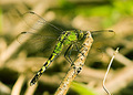
Dragons Fly?by tngrndreamComment: Trading Post comment
Composition/subject - Great choice of subject! Composition is good to get the body on the diagonal and get the wings nicely in the frame without being cramped. The picture would be better without the stick on the right and a bit less clutter in the background but when shooting nature, you take what you get!
Technical - Really very smooth given that it was shot at 1600! Focus is excellent.
Meets challenge - Yep, there's green in it. Like the bits of green in the background, too.
My opinion - A good bug shot, fascinating to look at. Not sure why it didn't score higher, but the sixes outnumbered the fours which is good. |
| Photographer found comment helpful. |
| 06/14/2006 09:20:38 AM |
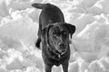
IMG_1769 (2).jpgby tngrndreamComment: Heh - I love the look! Nice shot, in that you kept detail in both the black and the white which is very tough to do. Really a cute picture! |
| 06/14/2006 07:24:29 AM |
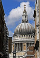
St Paul's Dome, Londonby obsidianComment: I like this angle - the building is nicely framed by those around it. Looks a bit strong on the sharpenening at this size, though. Sky is very nice! |
| Photographer found comment helpful. |
| 06/14/2006 07:22:48 AM |
James-processed.jpgby obsidianComment: I don't know how you did this but this is a great job of post processing to completely change the background as you have! It's a wee bit bright just below the one ear, but that's a nit. Great shot, too - nice catchlights on the eyes. |
| Photographer found comment helpful. |
| 06/13/2006 10:44:10 PM |
Lucy in the Skyby SkipComment: Forget "wow'ing" the DPC crowd - some of us like what you do just the way you do it and are pretty darn impressed with stuff like this. |
| Photographer found comment helpful. |
| 06/13/2006 10:36:27 PM |
|
| Photographer found comment helpful. |
| 06/13/2006 10:24:32 PM |
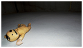
Dollhouseby LouisComment: Trading Post comment
Composition/subject - As I mentioned during the challenge, the doll is a bit on the scary side. Kudos for the homemade part! Composition for the basic picture enhances the creepy aspect very well.
Technical - Lighting is very good - all your work is generally very well lit for the subject choice.
Meets challenge - Yes, but I think showing a bit more of the back wall would have enhanced the "empty room" feeling.
My opinion - I have to admit this isn't my favorite picture of yours but I think that's due more to the subject matter and not the photography. |
| Photographer found comment helpful. |
| 06/13/2006 09:58:05 PM |
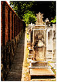
Persian Pedistal at Duskby chaliceComment: Trading Post comment
Composition/subject - This may sound weird, but it looks a little cramped for being an empty room shot. I think the statue needed to be a little further out into the room, and further away from the corner. It seems a little "top heavy" as it is shot now.
Technical - I really like the quality of light used and I like the monochromatic color scheme. This does limit the contrast you can get, though.
Meets challenge - Pretty much, but as I've noted above, you might have needed to show a bit more "empty room".
My opinion - Like the color scheme and the light, but the composition needs a bit of work. |
| Photographer found comment helpful. |
| 06/13/2006 09:34:48 PM |
Fatherby ericwooComment: I like the line you chose here - in particular, I like the shadow along the wall. |
| Photographer found comment helpful. |
Home -
Challenges -
Community -
League -
Photos -
Cameras -
Lenses -
Learn -
Help -
Terms of Use -
Privacy -
Top ^
DPChallenge, and website content and design, Copyright © 2001-2026 Challenging Technologies, LLC.
All digital photo copyrights belong to the photographers and may not be used without permission.
Current Server Time: 07/24/2026 09:12:21 PM EDT.