| Image |
Comment |
| 08/08/2006 10:41:57 PM |
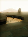
zen outtakeby KelliComment: I don't think it's boring. :-) See the Critique Trading Post thread - I played with it a little. |
 Photographer found comment helpful. Photographer found comment helpful. |
| 08/08/2006 10:08:37 PM |
|
| Photographer found comment helpful. |
| 08/08/2006 09:56:25 PM |
|
| Photographer found comment helpful. |
| 08/08/2006 09:53:49 PM |
Listen to the windby puzzledComment: Definitely works in B&W - the tones are rich and quite perfect in my opinion. A wonderful depiction of "zen" and a wonderful photograph! Congrats on the top ten, too - but that's just a side bonus - the shot and your processing of it is the real winner. |
| Photographer found comment helpful. |
| 08/08/2006 09:50:22 PM |
|
| Photographer found comment helpful. |
| 08/08/2006 09:49:51 PM |
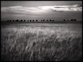
zenby whiteroomComment: I like the high contrast treatment - very effective for this. |
| Photographer found comment helpful. |
| 08/08/2006 09:48:18 PM |
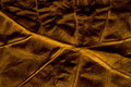
L I N E Sby hannekeComment: This is quite lovely - very very richly colored and textured. The strong diagonal really works here, too. |
| Photographer found comment helpful. |
| 08/08/2006 07:58:59 PM |
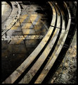
check your drinkby PurpleFireComment: Greetings from the Critique Club
First, I really appreciate including the photographer's comments - I find it both educational and enjoyable to read about how people set up, execute, and process their shots. Second, I'm quite impressed with the effort you put into creating the paper!
This is a good variation on a repeated theme here at DPC. The fact you've curved the background and not lined it up completely square/straight seemed to bother some commenters. To me, though, it seems quite complementary to the curves of the glass and adds an element of interest that wouldn't be there with perfectly straight lines.
I'll agree with one commenter that it's nice not to have the glass centered, but will also agree that I find it a bit too close to the right side of the frame.
Lighting is good - even if it was something you corrected in post processing - the final product shows no colorcast, no obvious underlit or overlit areas.
There are some visible 'jaggies' but I've yet to find a way to recommend to you to avoid those with very distinct lines presented on a video screen. These are not overly distracting, though.
A good finish and a nice addition to your top row on your profile page. |
| Photographer found comment helpful. |
| 08/08/2006 07:41:30 PM |
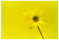
Just For Youby JudiComment: Greetings from the Critique Club!
First let me say I find it a bit intimidating to critique a shot of yours, but hey, you asked for it! Though I'm not entirely sure why you asked for a Critique Club comment... :-)
Definitely met the challenge, and did so very well. For color on color you did a great job matching the color of the flower to the background (I love the explanation of how you did that), and lighting it all so that the petals do nearly blend, as some of the commenters mentioned.
Composition is nicely balanced, despite not quite being rule of thirds and the center of the flower not quite on the center line. Just goes to show that when done well, rules are made to be at least stretched a bit. The two things that make this work, in my opinion, are the green center of the flower and the stem.
I commented on a similar shot from this challenge with "too much yellow". This just barely stays under that tipping point for me - almost too much yellow, but not quite. A well planned, well executed image. |
| Photographer found comment helpful. |
| 08/08/2006 02:08:22 PM |
Park Benchby gsalComment: This has an exceptional quality to it. Out of curiosity - is it a composite image, a single image, or a reflection? Not that it matters - it's lovely to look at as it is! |
| Photographer found comment helpful. |
Home -
Challenges -
Community -
League -
Photos -
Cameras -
Lenses -
Learn -
Help -
Terms of Use -
Privacy -
Top ^
DPChallenge, and website content and design, Copyright © 2001-2026 Challenging Technologies, LLC.
All digital photo copyrights belong to the photographers and may not be used without permission.
Current Server Time: 05/12/2026 10:51:11 AM EDT.