| Image |
Comment |
| 10/24/2006 10:18:14 PM |
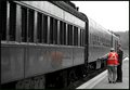
Study in Old Schoolby heathenComment: But you're supposed to get out of the car! Neat perspective to capture, though, since it's the way we all see trains at crossings. B&W works well for this. |
 Photographer found comment helpful. Photographer found comment helpful. |
| 10/24/2006 10:17:24 PM |
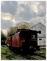
don't touch my cabooseby skewsmeComment: I love these old cars. I think I'd like to see it more from a vantage point a little further to the photographer's left. The red is very rich and lovely in this. |
| Photographer found comment helpful. |
| 10/24/2006 10:15:31 PM |
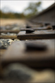
Foundationsby m2iwComment: As I suspect you intended, the rock is what draws the eye first, then the second tie. Very appropriate to your title and I'm assuming your intentions, though I suspect most will be put off by the very shallow DOF. |
| Photographer found comment helpful. |
| 10/24/2006 10:14:22 PM |
in trainingby saintaugustComment: I like the way the diagonal puts them nicely in the corner, and I like the spots of color in the vest, reflection, and sleeve. |
| Photographer found comment helpful. |
| 10/24/2006 10:09:25 PM |
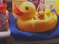
Enjoying The Westhouse!by 777STANComment: Greetings from the Critique Club
I really like the addition of the wabbit-duck to the ensemble - adds a different touch; and it does indeed seem that the ducks are enjoying their stay. The cloning work is very good - I've tried to see where it was done and really can't tell.
Technically, the image is noisy - I would suspect the original was a touch underexposed and you brought it up through post processing, leading to the noise artifacts. The illusion I think you're trying to create isn't quite there - I take the blue cloth to be the duckys' pond, but it looks more like just a blue cloth. While the addition of the refrigerated items helps to create your setting, the fact they're lit and focused equally with your subjects also detracts from the illusion. In the end, I think it comes down to the light - while using the fridge iight is a pretty neat idea, it didn't quite create the look I think you were after.
If you have any questions (or I didn't make much sense), please feel free to PM me. |
| Photographer found comment helpful. |
| 10/24/2006 09:16:09 PM |
Morning!by thomaspeopleComment: I obviously agree with your interpretation of mornings - I gave this a 7. Nice job, especially with the slow shutter speed. And this is one of those shots where "blown" most definitely works. |
| Photographer found comment helpful. |
| 10/24/2006 09:10:56 PM |
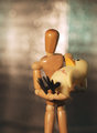
Friends, inseparable.by MajankaComment: Greetings from the Critique Club
Hi Majanka! In my opinion, you did a very fine job with this challenge. What I liked is the seemingly very real emotional bond between these two inanimate objects. You've convinced the viewer that these two are genuinely friends, from the pose you have Woody in and his gentle touch on his friend Ducky. The burning around the edges creates a nice vignetting touch which also adds to the "relationship" impression. Lighting is very good, focus is fine, and the simple composition helps create the simple message of friendship.
As I mentioned in my comment during the challenge, the one thing I did notice was that the Ducky seems awfully big compared to the Woody, but it's not distracting to me in any way. In fact, it creates just a bit more interest because of the size disparity.
Very nice job! |
| Photographer found comment helpful. |
| 10/24/2006 09:03:07 PM |
Wood Printby NovaTigerComment: Greetings from the Critique Club
This was one of my favorites in the challenge.
As I mentioned in my very short comment during the challenge, I really like this concept. What worked for me with this was the OOF actual woody and the in focus "on film" woody, both in the same pose. I'm not exactly sure WHY this works for me, but it does. I find it interesting that a lot of the other commenters wanted the real woody in focus - I don't think that I do at all - it would change the tenor of the picture completely. Composition with the strong diagonal works well.
The toning also works quite well, though given the "darkroom" imagery, I could also see it toned in red. And you do mention cloning out sensor dust - you missed a few. It's not something I noticed during the challenge but is something when I spend more time with the picture.
Nice work - this is the second of yours that's shown up on my "it's in my top 10, why not everyone else's?" list (the other was the feather).
If you have any questions, feel free to PM me. |
| 10/24/2006 07:45:36 AM |
Wounded Duckby meyersComment: Although I did like your challenge entry (it was really quite delightfully whimsical) I think you did do a better job with the lighting and such here. Nice bokeh, by the way. About the only thing I'm not too sure of is the marking on the ducky. The title conveys the "Wounded Duck" message, and without the title, it's a compassionate pose as it is. |
| Photographer found comment helpful. |
| 10/23/2006 11:29:29 PM |
|
| Photographer found comment helpful. |
Home -
Challenges -
Community -
League -
Photos -
Cameras -
Lenses -
Learn -
Help -
Terms of Use -
Privacy -
Top ^
DPChallenge, and website content and design, Copyright © 2001-2026 Challenging Technologies, LLC.
All digital photo copyrights belong to the photographers and may not be used without permission.
Current Server Time: 06/12/2026 11:09:54 PM EDT.