| Image |
Comment |
| 03/22/2007 03:39:05 PM |
Day 12 - Suspenseby xianartComment: Love the tones, gonna bookmark the link - thanks for sharing. Really like the lines in this, particularly the echoed ones of the light through the cracks. |
 Photographer found comment helpful. Photographer found comment helpful. |
| 03/22/2007 03:37:50 PM |
|
| Photographer found comment helpful. |
| 03/22/2007 03:29:42 PM |
|
| Photographer found comment helpful. |
| 03/22/2007 03:29:12 PM |
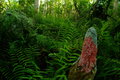
Swamp Lichenby MelonMusketeerComment: I love the richness of the greens in this, and just the bit of light poking through the trees at the top. Kind of eerie in a way, and the lichen provides a nice color contrast. |
| Photographer found comment helpful. |
| 03/21/2007 04:20:32 PM |
|
| Photographer found comment helpful. |
| 03/21/2007 04:08:15 PM |
|
| Photographer found comment helpful. |
| 03/21/2007 04:07:14 PM |
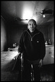
old man in his kitchenby SkipComment: Outstanding shot, Mr Rowland. Hopefully this was used in a story about Mr Johnson. And hopefully you'll follow up on the story when he gets his new house, too. Thanks again for giving us something real! |
| Photographer found comment helpful. |
| 03/21/2007 03:23:28 PM |
Kevlarby OmanOtterComment: Very cool! Thanks for posting this, the other picture, and the note in the thread. Very much appreciated. |
| Photographer found comment helpful. |
| 03/21/2007 03:17:04 PM |
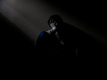
the Inner Painby MuppetComment: To address the too dark issue - when I see something on my main monitor that is "too dark", I check it on another monitor I have that is lighter. This one works on both monitors for me, though the second one does reveal a bit more. You made the picture you wanted, which is good, but you must also (for the sake of DPC only, not for your own purposes) make sure you take into account the wide range of monitors on which folks view these pictures. If you don't mind "too dark" as a comment, then that's cool.
For the picture, I like your "everyone has one of these, this is mine" comment. It means that you set out to do something specific and were pleased with the results. In my opinion, that's 90% (or more) of what we should all get out of photography. It is nice if someone else sees it, too, and from some of your comments, a few others did. I like the dual aspect of grain for the challenge - in the darkness there's grain, and there's the grain of the paint on the wall. I LOVE the wee bit of diagonal light - that's a particular favorite of mine. And while you mention you should probably have been more judicious in your choice of shirt to wear, I think the bit of color from the one you have on is perfectly placed in the frame.
I agree with dahkota's comments about the centering (and understand that you couldn't really change it, based on your comments in the thread.) Emotive shots like this can benefit by leaving more space on one side or another, or even at the top sometimes. Though that said, I'm not against centered compositions. Not everything works on the rule of thirds.
Key takeaways - you got what YOU wanted out of the shot and you got some useful feedback with respect to how others see (or don't see) what you tried to convey. I'll keep watching for your challenge entries! |
| Photographer found comment helpful. |
| 03/21/2007 02:28:06 AM |
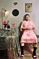
After The Partyby alfrescoComment: It's a lovely dress, JP. Really looks nice on you, too. The whole thing is set up perfectly, but it wouldn't have worked at all without the black socks. Great score, nice finish, and good to see you again! |
| Photographer found comment helpful. |
Home -
Challenges -
Community -
League -
Photos -
Cameras -
Lenses -
Learn -
Help -
Terms of Use -
Privacy -
Top ^
DPChallenge, and website content and design, Copyright © 2001-2026 Challenging Technologies, LLC.
All digital photo copyrights belong to the photographers and may not be used without permission.
Current Server Time: 08/24/2026 07:23:01 AM EDT.