| Image |
Comment |
| 05/01/2003 11:57:55 AM |
Come see what you're missingby TechnoShroomComment: Like the idea a lot and the layout of the text and logo.
Dislike the red colourising of the skin.
Strong matching of image chosen to strapline used.
7, Kavey |
| 05/01/2003 11:56:48 AM |
noneby indigo997Comment: A great design layout. I think for me the let-down is the text - "This is the digital photography contest for you" - not catchy and too long - could lose the "This is" for starters.
I think, changing that for a different strapline would make this a stronger contender.
7, Kavey |
 Photographer found comment helpful. Photographer found comment helpful. |
| 05/01/2003 11:55:44 AM |
|
| 05/01/2003 11:51:11 AM |
|
| Photographer found comment helpful. |
| 05/01/2003 11:47:33 AM |
Unique Imagesby imagesloyolaComment: Unusual and simple.
Only dislike is the choice of font for "Unique Images" which I think doesn't match well with the dpc font.
8, Kavey |
| 05/01/2003 11:45:35 AM |
create. submit.by helgihelgiComment: Professional. Striking. Enigmatic enough to make me want to visit the URL to find out more. My single 10 in this challenge. |
| Photographer found comment helpful. |
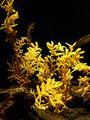
| 04/30/2003 05:15:50 PM |
Under Seas Floraby BAMartinComment: Critique Club
Initial thoughts
Great colour – love the combination of black and yellow. Composition seems random.
Composition/ Content
I like the way that some of the content is in the light and some is in shadow. I am struggling to find a point of focus – a hook into this picture. I do like that there is some negative space at the top of the frame.
Background
A good rich black – I think that helps make the yellow seem more vibrant.
Camera Work - Technical
It seems that detail/ texture is missing from the fronds under bright light – though it’s hard to tell what detail they actually have.
Fits The Challenge
Yes
My Opinion On The Photo
Great colours, but for me this lacks a focal point and hook.
|
| Photographer found comment helpful. |
| 04/30/2003 04:20:10 AM |
Sink Life at Happy Hourby MalokataComment: I'm sorry this didn't do better - I think it's one of the more creative ideas in the challenge and has humour, visual impact and strong composition... |
| Photographer found comment helpful. |
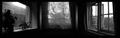
| 04/28/2003 12:34:04 PM |
Dreams of a Bay Windowby mbardeenComment: I like the atmosphere of this - kind of sad and full of longing. It also makes me think of someone sitting inside in the dark looking out of each of these windows. I am not sure about the gradiated separator lines. |
| Photographer found comment helpful. |
| 04/28/2003 12:32:55 PM |
Streetrodby crabappl3Comment: Nice individual images, though two are a little overwhelmed by the wonderful yellow one. I find the borders a little confusing. There are three images but the red border seems to combine two of them. That doesn't work for me,
I think the two images on the right are the strongest, individually. |
| Photographer found comment helpful. |
Home -
Challenges -
Community -
League -
Photos -
Cameras -
Lenses -
Learn -
Help -
Terms of Use -
Privacy -
Top ^
DPChallenge, and website content and design, Copyright © 2001-2026 Challenging Technologies, LLC.
All digital photo copyrights belong to the photographers and may not be used without permission.
Current Server Time: 07/25/2026 09:55:18 AM EDT.