|
|
|
Showing 9541 - 9550 of ~12478 |
| Image |
Comment |
| 06/13/2006 12:08:31 AM | |  Photographer found comment helpful. Photographer found comment helpful. |
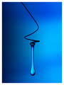
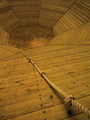
| 06/12/2006 12:47:14 AM | Only one way out- UP!by dabidejpnComment: *** C R I T I Q U E C L U B C O M M E N T ***
There's really nothing much to say about this except congrats on a personal best and a top-20 shot.
You clearly shot in available light, so no critique of the lighting is relevant. It's a little flat, but it is what it is. The color looks perhaps a little muddy, but it works very well. The composition is straightforward and interesting. It's perhaps not as sharp as it might be (a little more USM in processing?) but it's pretty good for an S9000.
What really works about this picture is the subject itself; it's a wonderful puzzle trying to figure out what the heck this "room" IS... Hopefully, you'll post in your notes and tell us :-)
Good work!
Robt. | | Photographer found comment helpful. |
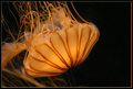
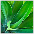
| 06/08/2006 01:50:50 PM | Glowby HOOlovesdrumsComment: *** C R I T I Q U E C L U B C O M M E N T ***
I've always loved jellyfish photos, and this is a very decent example of the genre. Speaking in the abstract, it perhaps falls short of the "best" jellyfish shots in the area of luminosity; the really enthralling ones, for me, have a positively ethereal glow, hovering between solidity and ephemeral translucence. As jellyfish shots go, this one is quite "solid", it's a more tangible effect you know?
Still, you work with what you've got; it's certainly not YOUR fault that the critter is what it is and the lighting is what it is.
What I LIKE about this shot is the very nice DOF control. That part's extremely well done. The colors seem perhaps a tad warm to me, but that's an issue of personal taste more than anything else. I have no idea how "accurate" they are, nor does it much matter to me, although it certainly would to, say, a marine biologist.
If the image has a shortcoming, really, IMO it6 is the composition, which doesn't feel quite right to me. The black is overpowering the jellyfish, and the "apex" of the canopy is right in the horizontal center of the image, neither of which I think is optimum. To my eye, if you crop out about half the black on the right, the composition becomes both more square and more dynamic, an odd juxtaposition I admit but there you have it.
In any event, a very nice and visually rewarding shot; it's the kind of image you can look at again and again and feel compelled by. Nice work, and a decent finish for you :-) |
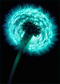
| 06/08/2006 02:30:09 AM | Milkweedby goldenhawkofkyComment: That's beautiful. Very nicely done. I only wish we could see the whole foreground flower (or group?). Sharpness and DOF impeccable, processing serene and clear. Nice one. | | Photographer found comment helpful. |
| 06/07/2006 06:52:11 PM | | | Photographer found comment helpful. |
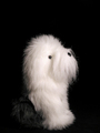
| 06/07/2006 03:08:17 PM | Did you say walkies?by joynimComment: For me, what stands out in a negative way is that we have lost most of the body of the dog. All we can see is the forelegs and the head, and just a hint of the rump in the shadows. It looks very unnatural to me. Lighting and exposure are excellent. | | Photographer found comment helpful. |
| 06/07/2006 12:35:56 AM | | | Photographer found comment helpful. |
| 06/07/2006 12:30:26 AM | |
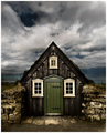
| 06/06/2006 03:09:11 PM | The Pastby DjabordjaborComment: *** C R I T I Q U E C L U B C O M M E N T ***
Hahaha! How fitting is this? I get to critique an image of the "monster" I enabled just a couple weeks ago!
This is an excellent image, one which I scored very high; and of course it just missed ribboning as well. So clearly you hit the mark here. Why did it do so well? Because it's moody, it "involves" the viewer in a tangible way, for one thing. Additionally, there's a fairytale quirkiness to the structure itself that is guaranteed to please people: based on the scale of the door, it's so TINY a structure, and it's like it's built INTO the ground, it just sings out loud of trolls and elves, hobbits and such. Very effective.
Nevertheless there's room for improvement. In pursuit of your "powerful" post processing, you've allowed the dark areas between stone and facade to block up a bit too much; it would be stronger with a tad more detail there. Also, there's a slight but distinct haloing between sky & roof, especially at the very top.
I've taken the liberty of doing a very quick & rough edit to show you what I'm talking about. let me know what you think :-)

Robt. | | Photographer found comment helpful. |
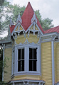
| 06/06/2006 02:51:58 PM | A Spire To Greater Heights!by 777STANComment: *** C R I T I Q U E C L U B C O M M E N T ***
While this image is definitely "of" architecture (it meets the challenge) It unfortunately has little to recommend it as a photograph. Let me see if I can explain why:
1. First and foremost, architectural subjects really cry out for what I call the "definitive light". Here, the light is so flat and even that we have no sense of either texture or 3-dimensionality.
2. The colors are drab and lifeless. This can be corrected in PP to a great extent.
3. The composition is extremely awkward. It feels tight and cramped, and we have a sense of important pieces being left out: this is especially true at the bottom, where the fretwork under the bay window is hinted at but not expressed. See also where the roofline is cut off on the left, and how the little "L" in the roofline on the right is not fully expressed; it just needs more breathing room all around.
Thius is a lovely subject, and you could definitely make an appealing image out of it if you went back at the right time of day :-) | | Photographer found comment helpful. |
|
Showing 9541 - 9550 of ~12478 |
Home -
Challenges -
Community -
League -
Photos -
Cameras -
Lenses -
Learn -
Help -
Terms of Use -
Privacy -
Top ^
DPChallenge, and website content and design, Copyright © 2001-2026 Challenging Technologies, LLC.
All digital photo copyrights belong to the photographers and may not be used without permission.
Current Server Time: 05/07/2026 10:40:18 PM EDT.
|