|
|
|
Showing 2581 - 2590 of ~12485 |
| Image |
Comment |
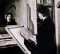
| 10/17/2013 07:20:47 AM | The Picture of Dorian Gray by mrchhasComment: This is very well worked. It feels utterly *period*, which is critical. Fits the book like a glove. Well done! The shadow on the wall in the center bugs the HELL out of me, and some vignette upper right might be useful, but other than that this is 100% "GO" and I'll give it an 8. |  Photographer found comment helpful. Photographer found comment helpful. |
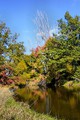
| 10/17/2013 07:18:44 AM | "A River Runs Through It" by Norman Maclean by rjksteschComment: Nothing much to say here as it doesn't inspire deeper thoughts in me, but this is a very nice image that fits the title and the book very well. I'm a little less than satisfied with the actual *quality* of the image: it seems to lack sharpness at a critical level, though of course it's hard to say why at 800 pixels, but in any case it's not a serious flaw.
The white inline on the border, on the other hand, is kind of overpowering. It would work better if it were less white and not as thick, but I don't generally score down for borders.
7 from me. | | Photographer found comment helpful. |
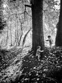
| 10/17/2013 07:14:59 AM | Lord of the Fliesby jaysonmcComment: This is actually quite troubling... Absent the title reference, I'd just see a couple of de-pantsed youngsters running around a tree, but you had to bring THAT up, and now every time I look at it, I'm seeing darker things. So it's effective in that regard, and nicely constructed as well. For me, I'd have expected something more overtly *savage*, face paint and defiant stares, but you took a different path and it's quite effective.
8 from me. | | Photographer found comment helpful. |
| 10/17/2013 01:09:10 AM | Cold Comfort Farm - Stella Gibbons by StagoleeComment: This is difficult for me, because I love the book and I want to like the image, which is indeed pleasant enough as those things go, but pleasant isn't what Cold Comfort Farm is about, now is it? These are confused, rustic people living in squalid surroundings, hostage to a past that no longer sustains them, and I want at least a hint of that in the imagery.
So it's a 4 from me. | | Photographer found comment helpful. |
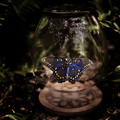
| 10/16/2013 04:32:07 PM | The Bell Jarby grahamgatorComment: The Bell Jar is a novel about madness, emptiness, and pain. There's a sense in which the pain can be seen to lead to rebirth, and a butterfly, emerged from its chrysalis, can be seen to embody that transformation, so the connection to the novel's not that far-fetched. Notwithstanding that, however, this is an awfully cheerful image to represent such a bleak book.
Also, as a nit, this isn't shaped like any bell jar I'VE ever seen. Bell jars are designed to seal an atmosphere or a vacuum, and they are usually shaped like cylindrical domes.
Still, it's got a deeper-than-obvious connection to the book and it's competently crafted. I'll give it a 6. | | Photographer found comment helpful. |
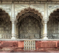
| 10/16/2013 04:17:06 PM | Zafar Mahal - "The Last Mughal" by William Dalrympleby dougi555Comment: I love the delicacy of the rendering here, the frieze-like quality of the processing, which perfectly presents the elaborate intricacy of both materials and architecture. On a further technical note, you've squared it up nearly flawlessly; there's a bit of keystoning (slightly wider at top than at bottom, but the horizontals seem spot on, the POV is exactly on center, it's all as it should be.
Fits the book fine too. One might have expected a more decadent picture, but....
Regardless. It's an 8 for now, with possible bump depending on the rest of my voting. |
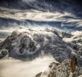
| 10/16/2013 03:19:22 PM | Magic Mountain by Thomas Mann by MargaretNetComment: This is gorgeous! Where the heck are you? Wonderful drama and processing.
Works well with the book, which not only takes PLACE in the Alps (Davos, if I recall correctly) but use the METAPHOR of mountains at several levels as it wends its elusive way towards a conclusion.
Well done, an 8 for now (I sort my highest votes up when I am done) | | Photographer found comment helpful. |
| 10/16/2013 03:15:12 PM | Brave New World - Aldous Huxleyby DamonComment: This is a remarkably lovely image but it has absolutely nothing to do with the novel. The novel is a dystopian vision of the near future, a bleak, industrial future marked by conformity and despair, it's all about people and their struggles. THIS is a romantic vision, not a dystopian one. For what it's worth, the novel's title borrows from Shakespeare: "O, brave new world, that has such people in it!"
It's a good picture, 5 would make it below average which I don't want to do, so I give it a 6. | | Photographer found comment helpful. |
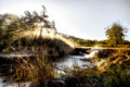
| 10/16/2013 03:10:37 PM | "A Prayer for Owen Meany"by DudskiComment: A striking image of remarkably intense clarity, presumably infrared though, if so, a nicely muted infrared. Technically it's excellent. I wonder if you need all the space on the left, but it's a nit. As far as fitting the book, it does so very well. Good job capturing the intensity of the religious theme that ties the book together.
8 from me, with the possibility of moving up at voting's end. |
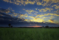
| 10/16/2013 03:00:13 PM | On Golden Pondby dtremainComment: This, for me, is just a snapshot taken with no concern for the quality of the light, and then not processed to advantage at all. Plus the pond's not golden at all. You really need the golden-hour light to make this one work for you.
4 from me. | | Photographer found comment helpful. |
|
Showing 2581 - 2590 of ~12485 |
Home -
Challenges -
Community -
League -
Photos -
Cameras -
Lenses -
Learn -
Help -
Terms of Use -
Privacy -
Top ^
DPChallenge, and website content and design, Copyright © 2001-2026 Challenging Technologies, LLC.
All digital photo copyrights belong to the photographers and may not be used without permission.
Current Server Time: 07/19/2026 01:07:52 PM EDT.
|