| Image |
Comment |
| 12/29/2004 08:49:05 PM |
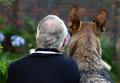
Friendshipby angiedlComment: Rankles, they appear to be looking out through a screen of some sort, maybe on jalousied windows? I'm not sure, but it's something. A screen would account for the diffusion effect, I think.
Robt.
|
 Photographer found comment helpful. Photographer found comment helpful. |
| 12/29/2004 08:46:05 PM |
Friendshipby angiedlComment: I'm stunned this didn't finish in the mid-7's at least. I thought it was poignant and imaginative and immensely appealing. Congrats, regardless, on your 16th place.
Robt.
|
| Photographer found comment helpful. |
| 12/29/2004 02:49:17 PM |
|
| Photographer found comment helpful. |
| 12/29/2004 02:48:38 PM |
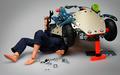
Meccano Mechanicby angiedlComment: This is funny. I like it a lot but it needs more DOF: feet, especially, should be sharp. Ought to be possible too, just by moving the point of critical focus forward a tad. DOF is 1/3 in front and 2/3 behind POCF as a rule of thumb, so there's some wiggle room here. |
| Photographer found comment helpful. |
| 12/29/2004 02:46:59 PM |
|
| Photographer found comment helpful. |
| 12/29/2004 02:46:21 PM |
Let It Snow!by novaComment: Clean and simple repeating composition, but ultimately it feels sort of static, which it ought not to considering the subject. |
| Photographer found comment helpful. |
| 12/29/2004 02:45:12 PM |
Diesel trainby FinfsComment: A striking composition marred by a muddy sense of color. The super-bright, super-centered light is a major distraction. Seems lacking in visual acuity as well. |
| Photographer found comment helpful. |
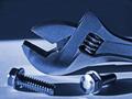
| 12/29/2004 02:43:00 PM |
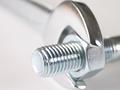
Blue Steelby jessfrolioComment: DOF seems way off to me, the blurred screws/bolts are disturbing me. The relatively crude blue tonalities seem forced. I'd like to see more separation between arc of the upper wrench jaw and the BG. |
| Photographer found comment helpful. |
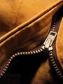
| 12/29/2004 02:41:42 PM |
Mechanical Pantsby jduffettComment: I'm surprised this is the only zipper... Lighting seems a little hartsh to me, composition is sweet. |
| Photographer found comment helpful. |
| 12/29/2004 02:41:02 PM |
|
| Photographer found comment helpful. |
Home -
Challenges -
Community -
League -
Photos -
Cameras -
Lenses -
Learn -
Help -
Terms of Use -
Privacy -
Top ^
DPChallenge, and website content and design, Copyright © 2001-2026 Challenging Technologies, LLC.
All digital photo copyrights belong to the photographers and may not be used without permission.
Current Server Time: 06/19/2026 04:16:17 PM EDT.