|
|
|
Showing 11861 - 11870 of ~12484 |
| Image |
Comment |
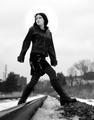
| 01/09/2005 06:32:26 AM | The Short Cutby ColeyComment: A striking image, marred by the artefacts in the sky. Nice control of the dark tones. |  Photographer found comment helpful. Photographer found comment helpful. |
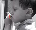
| 01/09/2005 06:29:46 AM | Bubble Boyby megryanComment: A pretty luscious image. I'm not wild about the selective desaturation. Maybe if the red were less agressive it would work better for me. | | Photographer found comment helpful. |
| 01/09/2005 06:28:47 AM | |
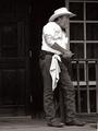
| 01/09/2005 06:27:47 AM | Cowboy Cookby BAMartinComment: Luscious tonalities, rich dark areas. Awkward composition to my eyes, I'd liek to see half as much black behind the figure and more added in the direction to which he's looking. he's trapped by this framing. | | Photographer found comment helpful. |
| 01/09/2005 06:25:13 AM | | | Photographer found comment helpful. |
| 01/09/2005 06:24:14 AM | Last Surferby DiscraftComment: This doesn't feel "candid" to me; it's more of a scenic or mood shot. I wish the horizon were leveled, though. |
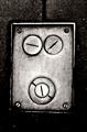
| 01/09/2005 03:01:02 AM | I'm Going Slightly Madby TranquilComment: *** CRITIQUE CLUB COMMENT ***
This is a beautiful image and well deserves it's high finish in the challenge. The "face" itself is almost startlingly whimiscal and appealing.
Looking at it as a B/W print, I see a lack of detail in the darkest areas that might profitably be fixed, if the information is in the exposure. Speaking in zone system terms, you have a lot of "zone 2" areas that could be raised to "zone 3" (the zone of minimal shadow detail) to the enhancement of the image. this is particularly true where the cover plate falls off into the background in the lower corners and on the right edge a thrid of the way up. A hint of separation of plate from BG would be a plus in these spots.
Otherwise, the tonalities on the plate itself are wonderfully rich and tactile.
From a compositional perspective, I think it's a little TOO balanced top-and-bottom. I'd prefer to see a smifgen removed from the top and added to the bottom, in much the same way that we matte prints with a bit more space below than above.
Great picture, and a pleasure to comment upon.
Robt.
| | Photographer found comment helpful. |
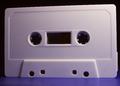
| 01/09/2005 02:53:00 AM | The Face Behind The Voiceby fotodudeComment: *** CRITIQUE CLUB COMMENTS ***
This is not really avery interesting photograph, to me, and I think you've acknowledged that yourself in your own comments. The lighting is quite decent, very tactile; that's about the only positive I can come up with.
The cropping is way too tight, especially on the right. Give it a little more room to breathe. It's also very grainy; was this a desired effect or were you shooting in low-fidelity mode? The scallops on the top edge are very odd. Are they actually there, or is this an artefact created by the rendering of the diagonal line at a low resolution?
Robt.
| | Photographer found comment helpful. |
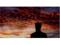
| 01/09/2005 02:47:35 AM | to ugly face for such beautiful sunset!!!!by simbaComment: *** CRITIQUE CLUB COMMENT ***
You've already heard about the "flaws" of this image in terms of the challenge; it does not meet the terms of the challenge, inasmuch as even though the face is hidden in this picture it is still an actual face. The challenge was about "finding" faces in things that aren't really faces; tree trunks, reflections, cloud formations, the possibilities were endless.
You've also heard that the white spaces here, and the tiny margins right and left, are very offputting, and I agree.
Speaking of it as an image, it's in many ways quite spectacular. It's a brooding, strong photograph. It's not 100% to my taste, but it seems to me you've probably accomplished what you set out to do. Just out of a sense of exeprimentation, you might try taking this image and reducing the contrast/oversaturation a little bit in the sky, maybe even soften it up a bit, and see how that alters the mood of the thing. There are many, many ways you could handle the post-processing on this image.
Robt.
|
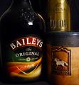
| 01/09/2005 02:39:39 AM | Less Coffee. More Bailey's.by swagmanComment: *** CRITIQUE CLUB COMMENT ***
Rich tonalities are attractive. Composition is a little static to be truly engrossing, split as it is into such a nearly symmetrical opposition of halves. Image suffers from blocking up in the shadows; more care with the lighting would have given richer dark areas and more wow factor. The s-curve upper left is attractive, but I keep wanting to read it as the shoulder of the bottle and it seems at odds with the hilit right shoulder of the same bottle. Falloff of light on the word "Baileys" is a little offputting to me, as is the asymmetrical distortion of the arch of this label.
Robt.
And, Swagman my friend, this was a random draw :-) |
|
Showing 11861 - 11870 of ~12484 |
Home -
Challenges -
Community -
League -
Photos -
Cameras -
Lenses -
Learn -
Help -
Terms of Use -
Privacy -
Top ^
DPChallenge, and website content and design, Copyright © 2001-2026 Challenging Technologies, LLC.
All digital photo copyrights belong to the photographers and may not be used without permission.
Current Server Time: 06/21/2026 01:56:13 AM EDT.
|