| Image |
Comment |
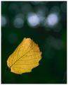
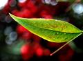
| 01/10/2005 02:51:52 AM |
Leafby gaurawaComment: The leaf itself is very nice. The placement of the artefacts in such a linear mode is not working IMO; the image is stratified into zones, where I'd like to see a smoother inhterplay between foreground and BG. |
 Photographer found comment helpful. Photographer found comment helpful. |
| 01/10/2005 02:50:34 AM |
Remnantsby connieComment: Interesting "crosshatch" bokeh. Pic seems too hi-key to me, yet harsh at same time, unusual. composition a bit static. Nice effort. |
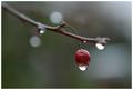
| 01/10/2005 02:49:30 AM |
Until Next Yearby karmatComment: True bokeh, and beautifully lit. IMO it's a pity the bokeh highlights are such a harsh white. |
| Photographer found comment helpful. |
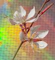
| 01/10/2005 02:48:37 AM |
White gaura flowerby Pug-HComment: Fascinating bokeh. Subject seems too flat for best effect; I'd have played with increasing sense of luminance on subject. |
| Photographer found comment helpful. |
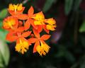
| 01/10/2005 02:47:36 AM |
Wild Flowersby RgarciaComment: More of a shallow DOF than a true bokeh, IMO. Stunning image though. Good work. |
| Photographer found comment helpful. |
| 01/10/2005 02:46:48 AM |
|
| Photographer found comment helpful. |
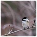
| 01/10/2005 02:46:01 AM |
Suspensionby les0910Comment: LOL, I shot this same damned pic a couple years ago, totally different yet 'the same". Remind me to show you. A nice sense of desolation. |
| Photographer found comment helpful. |
| 01/10/2005 02:44:54 AM |
The Lone Leafby MontereykiddoComment: True bokeh. Upper left hot spot a major distraction. Feels a bit over-saturated and harsh to me. Right side feels tight. |
| Photographer found comment helpful. |
| 01/10/2005 02:43:39 AM |
|
| Photographer found comment helpful. |
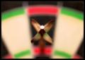
| 01/10/2005 02:42:47 AM |
Treble 20by KonadorComment: Interesting abstract. Interesting bokeh, for that matter. My eye's having a hard time deciding where to go here. High points for originality. |
| Photographer found comment helpful. |
Home -
Challenges -
Community -
League -
Photos -
Cameras -
Lenses -
Learn -
Help -
Terms of Use -
Privacy -
Top ^
DPChallenge, and website content and design, Copyright © 2001-2026 Challenging Technologies, LLC.
All digital photo copyrights belong to the photographers and may not be used without permission.
Current Server Time: 06/21/2026 05:43:16 AM EDT.