| Image |
Comment |
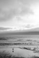
| 05/04/2005 12:28:22 AM |
Last Waveby ZoomdakComment: Very nice shot zoom, serene and understated and effective. Probably would've ribboned if you'd stuck the rock in over there on the left, LOL. |
 Photographer found comment helpful. Photographer found comment helpful. |
| 05/04/2005 12:26:43 AM |
|
| Photographer found comment helpful. |
| 05/04/2005 12:25:29 AM |
|
| Photographer found comment helpful. |
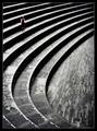
| 05/04/2005 12:24:33 AM |
Sunset Feeding by StagoleeComment: Great finish! I'm not in the least surprised. Was in my top 5 voting. Congrats! |
| Photographer found comment helpful. |
| 05/03/2005 04:02:14 PM |
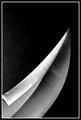
Bladeby JohannesFrankComment: Minimalist in the pure sense, and a lovely "abstract" as well, but failing to meet the challenge as the subject is taking up too much of the picture area, IMO |
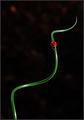
| 05/03/2005 04:00:15 PM |
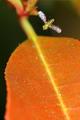
a good place to landby ovenbirdComment: Can't have beene asy to capture this. The fly pis lovely, the leaf part is pretty well overpowering the shot though. I wonder if you could have desatted this within basic rules? by dumping some red out? How that woudl have effected the fly? I donno. Nice capture regardless. |
| 05/03/2005 03:57:38 PM |
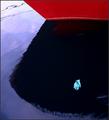
The Grain Of Riceby SondaComment: That's a very strange image. Beautifully cropped, luscious tonalities, social commentary up the wazoo in a minimalist setting. Strong entry. |
| Photographer found comment helpful. |
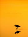
| 05/03/2005 03:56:24 PM |
door knobby robadsyComment: Nice and clean. Doesn't excite me, but I like the "design" of it. |
| Photographer found comment helpful. |
| 05/03/2005 03:55:48 PM |
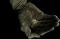
The mermaid's gloveby arngrimurComment: I've had this parked in 6.0 while I try to make up my mind whether I love it or hate it. That's a very strange hand. For the longest time I was reading it as the reflection of a hand on the prow of the boat, a painted hand; now I think it's a latex glove floating by, which of course is TRULY odd. Regardless, the image keeps me coming back so I'm rewarding it with a 2 point bump. |
| Photographer found comment helpful. |
| 05/03/2005 03:53:14 PM |
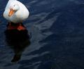
Fearless White Duckby ccaseyComment: There's a lot tolike in this shot, but the slight crop onto the tail is hurting it in my eyes. I don't know if it's intentional, or all you had to work with. I accept that you may have been going for some visual tension with the crop, but for me it would have worked better as an image if the tail were intact I think. Nice shot, lovely dark texture work. |
Home -
Challenges -
Community -
League -
Photos -
Cameras -
Lenses -
Learn -
Help -
Terms of Use -
Privacy -
Top ^
DPChallenge, and website content and design, Copyright © 2001-2026 Challenging Technologies, LLC.
All digital photo copyrights belong to the photographers and may not be used without permission.
Current Server Time: 06/25/2026 11:24:55 AM EDT.