| Image |
Comment |
| 07/28/2005 12:33:58 PM |
|
 Photographer found comment helpful. Photographer found comment helpful. |
| 07/28/2005 02:16:39 AM |
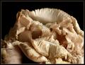
Oyster Mushrooms — Cluster 1by Bear_MusicComment: Originally posted by dahkota:
Robert, For what its worth, my opinion... The technicals in this image are good. What I think this image lacks is a point of focus. Not camera focus, but more of a 'where do my eyes go' focus. Since this is more of an abstract image, my eyes tend to go to the lights and darks. The lightest lights and the darkest darks have no texture. So I look at the edges, the changes in tonality. The edges fall across the image randomly with no order or pattern for me to follow. The strongest lines swoop me down to the bottom right - into a jumbled mass. This makes the entire image seem to be draining out of the bottom right. The strong black at the top left reinforces that. Hope what I stated makes some sense... |
Yes, it makes perfect sense. That's the dynamic of the composition. Rule of thirds it ain't :-) Be a good one for Setzler's "breaking the rules" class, actually. |
| 07/27/2005 12:24:42 AM |
|
| Photographer found comment helpful. |
| 07/27/2005 12:15:54 AM |
|
| Photographer found comment helpful. |
| 07/26/2005 04:18:02 PM |
|
| Photographer found comment helpful. |
| 07/26/2005 04:16:49 PM |
pollinationby SeanachaiComment: You're to be commended for the very natural rendition of this. It's nice to see a flower NOT oversaturated. The sheer imperfection of the elements is compelling; even the bee looks tattered. |
| Photographer found comment helpful. |
| 07/26/2005 04:15:29 PM |
|
| Photographer found comment helpful. |
| 07/26/2005 04:14:42 PM |
|
| Photographer found comment helpful. |
| 07/26/2005 04:14:16 PM |
liquidby rhipsterComment: Yes, smooth is a texture. Very luminous and well-done. |
| Photographer found comment helpful. |
| 07/26/2005 04:13:13 PM |
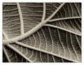
Complexities of a simple leafby gaurawaComment: A tour-de-force as far as I'm concerned; beautiful PP and stands above the other leaf entries in its much more dynamic, original composition. The texture, of course, is palpable. |
| Photographer found comment helpful. |
Home -
Challenges -
Community -
League -
Photos -
Cameras -
Lenses -
Learn -
Help -
Terms of Use -
Privacy -
Top ^
DPChallenge, and website content and design, Copyright © 2001-2026 Challenging Technologies, LLC.
All digital photo copyrights belong to the photographers and may not be used without permission.
Current Server Time: 07/18/2026 04:47:13 PM EDT.